Not a discovery: design is getting more and more human. Finally, we design rather for living people than robots (Hey, SEO!). Copyright and microcopies, chatbots — they aren’t for a tick anymore, but for better interactions between you, your product and the user.
The 404 page, which is my today’s emphasis, is another stop on the Jedi’s path to ultimate user-oriented approach. It starts with a nice trend, but primarily reverses a negative effect, where the user feels frustrated with the way the website behaves — as well as gives a clear understanding of where to click next. Or haven’t you ever shut a 404 tab with “Ey, whatever, not this time?”
Choose your effective 404 page
There are three major strategies you can take while working out a 404 page of yours. However, you aren’t limited by a single-choice direction, as you can freely mix them while pursuing a certain message.
Supportive content
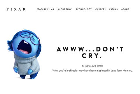
First, whatever your further/general plan is, supportive content will be perfect to fight the negative reaction. An error is never what a user is expecting, so they WILL fill annoyed, irritated or nervous — as at a talk with a person who can’t catch a word they’re saying. So by explaining the situation, getting some words of empathy and sharing the right emotion, you can make a person breath easier and not start hating the place.
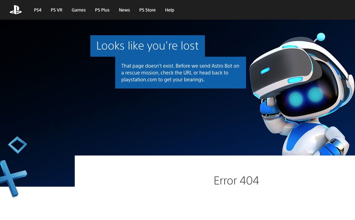
Looks like you're lost but Astro Bot won't let you go
Providing options
Another strategy is to provide options. Share some ideas (links) on where to click next, show the way out or simply and the functional to return to the search. That’s how you’ll show everything’s okay — and prove it.
Ueno’s panicky sausage and a button to take you back | ueno.co
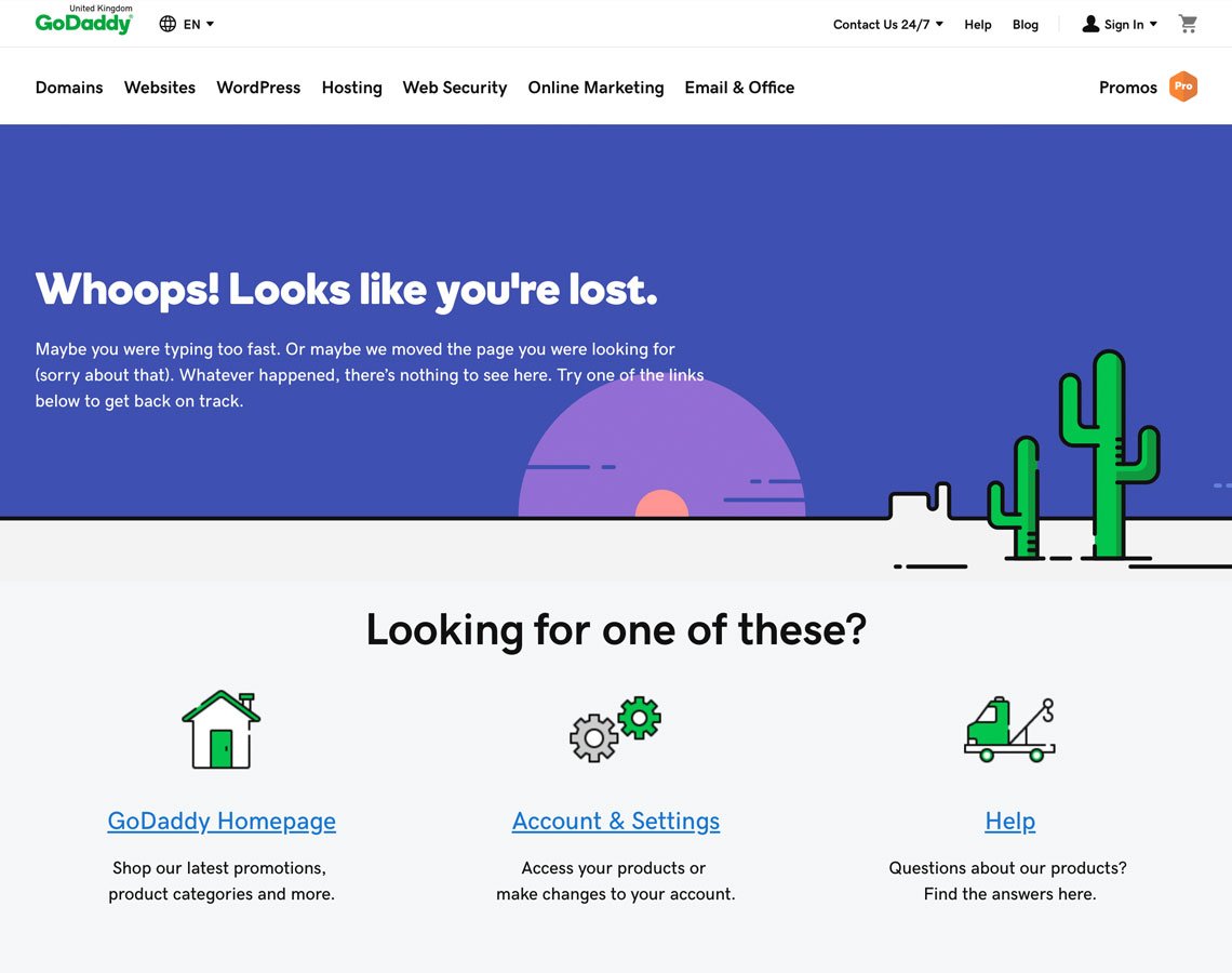
GoDaddy comes with quite an evident yet, true, effective solution
Interactivity & gamification
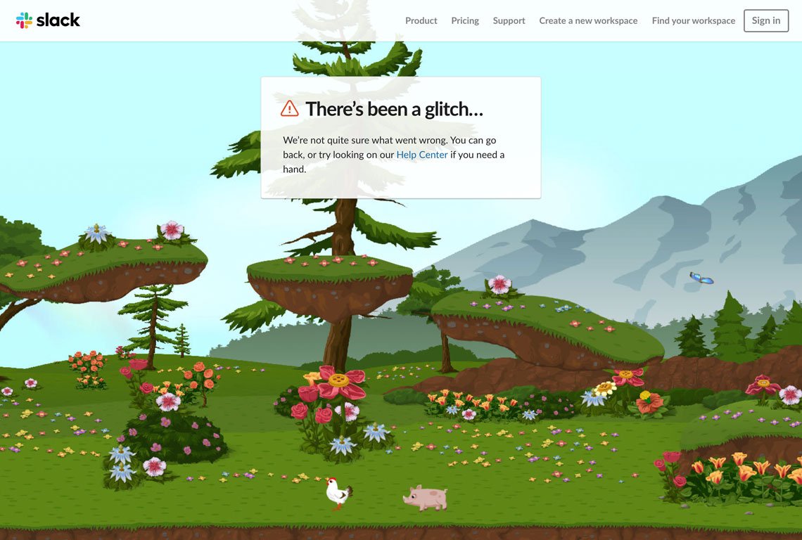
Finally, interactivity & gamification, which I love a lot. And I don’t know who doesn’t. Slack are my icons here, I feel happier in their wonderland than on the rest of the world I live in (just haven’t found a piggy to pet yet).
Not so easy, actually. This 404 page is actually checking if you are ready for having a car | carwow.co.uk
The best place you can ever be 😅
Best practices?
Sure. And they hardly ever go beyond your general knowledge of UI/UX.
Mind the style (but do some risk too)
They say less is more, so the 404 should speak the same visual language. So, if possible, implement this page in the design system of your project, but also try wheeling out something extraordinary, the effect can be louder.
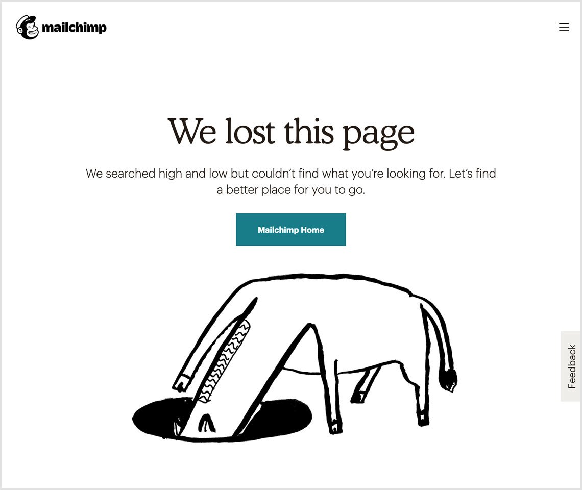
The well-know absurd illustrations of MailChimp
Show the alternative way
Click Back? You serious? Instead, give your user some options like some helpful links or a search-bar to keep on wandering, which are always better than to go back or shut the window.
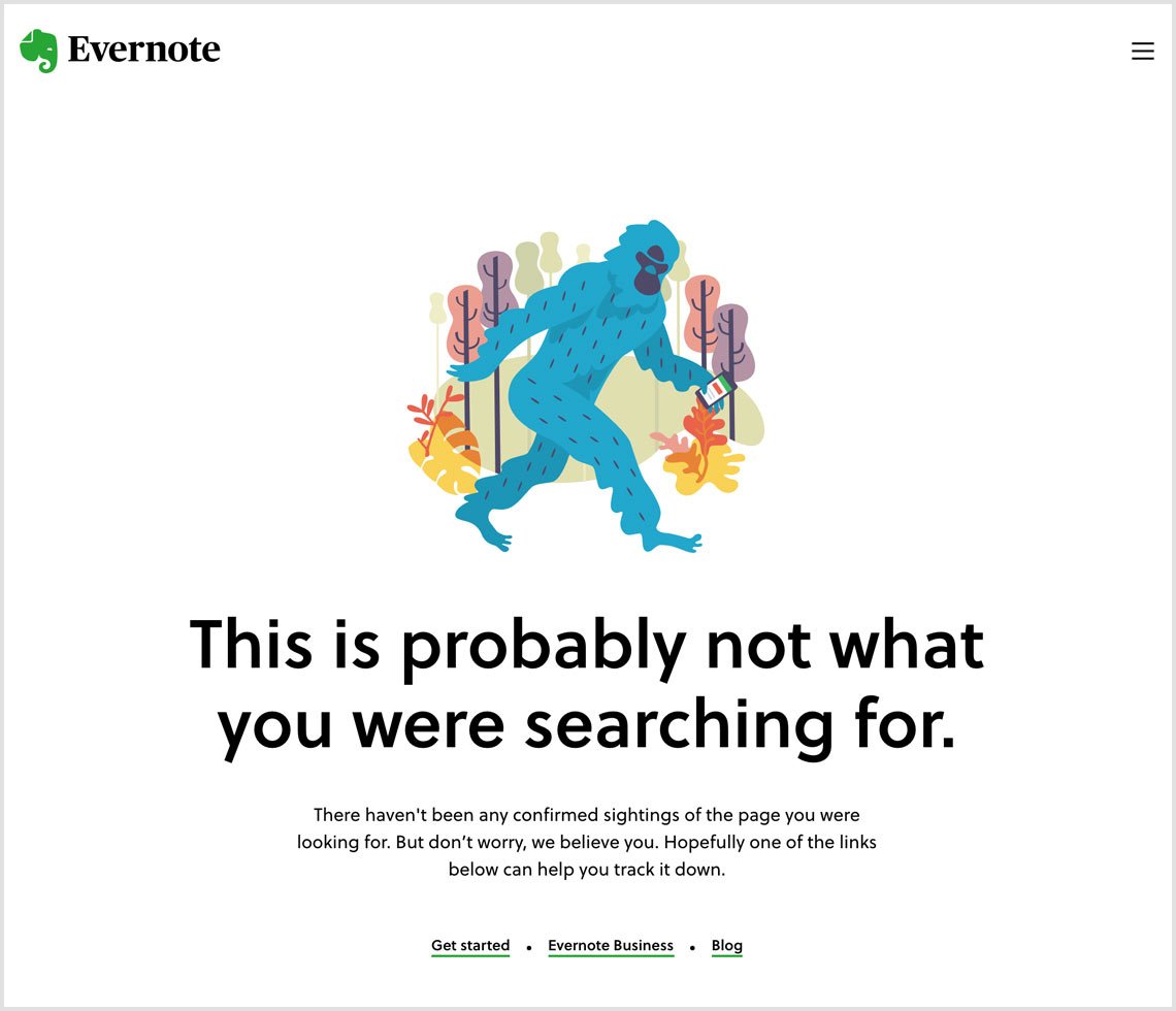
So you use the alternative links and follow the Yeti
Have a human talk
Remember to care about the copy and keep it as personal as it’s applicable for the site. Tell what’s gone wrong. Give some support. Tell what to do next. You can even humor if you, well, can.
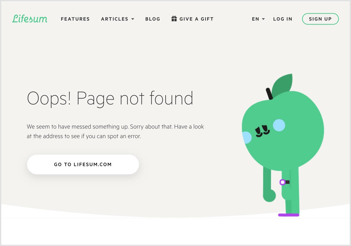
When an upset apple is worth a million words of support
Add some interactivity
And in a minute the user will forget it was actually the 404 error page. They just come up with an error and a mini-game, play it for a while and keep working with a feeling something good has just happened.
A couple of levels and you forget what you actually came for | kualo.com
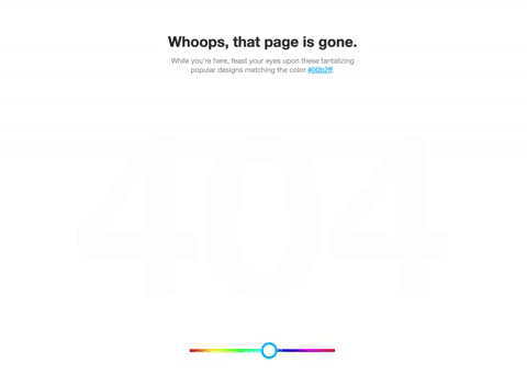
Color magic of the Dribbble 404 page
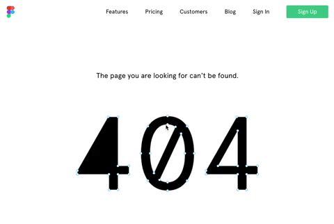
A bit of Figma at the 404 page
Try to be funny
Again, you don’t have to. But if it’s acceptable, if your audience likes it and you feel like it, do it! All in all, such 404 pages may make people speak & tweet more about you. And nullifies the negativity replacing it with fun, joy or whatever.
The experience of creating a memorable 404 page has gone really rich, so there is a vast abundance of curious solutions from tech monsters and small start-ups, all edible. And since this part of development is quite amusing (true), creative (true) and not harder than the rest of works (again, true), there is a heavy point in considering it for your site to boost the user experience.