• Home
  • Design
  • Freebies
  • Toolbox
  • Tech
  • Tutorials
  • Inspiration
No Result
View All Result
Subscribe
The Designest
  • Home
  • Design
  • Freebies
  • Toolbox
  • Tech
  • Tutorials
  • Inspiration
No Result
View All Result
The Designest
No Result
View All Result
Home Design

130 Eye-Catching Color Combinations For Design Enthusiasts

An endless flow of color inspiration in every scheme and image!

Ksenia Pedchenko by Ksenia Pedchenko
April 27, 2022
in Design, Inspiration, Toolbox
3
Share on FacebookShare on Twitter

The Designest may receive compensation from companies, products, and services featured in this publication. For more details, please refer to our Affiliate Disclosure page.

Understanding the color and knowing how to make a powerful color combination is a secret to good design. In fact, it matters as much as knowing the basics of typography and mastering the golden ratio. However, when we speak of color, theory isn’t enough, and there is always a huge emotional component in every palette.

The color can tell much more than you think, and a beautiful color combination may become as distinctive and memorable as the entire branding concept. Think of the refreshing and confident green-black-white of the Starbucks logo or Coca Cola’s white and red the makes you think of it even when seen outside the logo and merchandise. From the other side, color expresses the mood, and can fill the viewers with a rainbow of emotions once they see the well-balanced palette.

Color Theory Applied to Online Projects

by James Eccleston

Color Theory in Photography

by Yaopey Yong

Color Theory: How to Apply It to Your Images

by Jean Fraisse

domestika logo

Expand Your Creative Skills With Domestika Classes

Explore thousands of creative classes in design, business, visual art and craft! Whatever skill you want to improve, Domestika has a course for it! Use the code THEDESIGNEST-10 to get an additional 10% off.

Redeem Your Code Today ➔

In fact, I’m sure you know yourself all the perks and powers of a good color combination. So here comes another question — how to make something totally fascinating and where to source inspiration from? The answer is simple: with the basics of color theory you can make billions of them and get something perfectly fitting you project in the end. Or you’ll have a hundred of ready-made beautiful color palettes imbued with natural, urban and floral vibes — which we’ve prepared for you. You’ll just have to transfer these color combinations to your project.

Ready to get inspired? Wait a little, color theory goes first!
  relevant:
30+ Best Instagram Color Schemes & Aesthetic Ideas April 27, 2023
Next
Prev

How to Make Color Combinations?

In color theory, colors are organized on a color wheel and grouped into 3 categories:

  • Primary colors: the basic red, yellow and blue;
  • Secondary colors: made from primary colors (orange, violet and green);
  • Tertiary colors: made from primary and secondary colors (red-orange, yellow-orange, yellow-green, blue-green, blue-violet, and red-violet).
Primary colors
Secondary colors
Tertiary colors

If you look at the color wheel and draw an imaginary vertical line, you’ll get warm colors from one side and cold from another. That the basics you should know before onboarding a custom color combination.

There are four types of color combinations:

  • Complementary color combinations — made from colors that sit opposite each other on the color wheel.
  • Triadic color combinations — made from colors placed on each vertex of an imaginary equilateral triangle (it’s a triange in which all three sides have the same length).
  • Analogous color combinations — made of 2-5 colors that sit next to one another on the color wheel.
  • Tetradic color combinations — made of 4 colors that are equidistant apart. There is one primary and two complementary colors, and also an additional color to highlight accents.
Color Theory - Complementary color combinations
Color Theory - Triadic color combinations
Color Theory - Analogous color combinations
Color Theory - Tetradic color combinations

With this knowledge, you can try making a custom color palette and see if it works for your projects. However, an isolated understanding of what color combinations can be doesn’t always work. You may need time to gain some experience and start making color combinations that are not just technically correct but evoke necessary emotions and fit your project.

How to Use Color Combinations?

1. Use the Base-Nuance-Accent method

When working with colors, it is important to ensure that they work well with each other. To do this, the colors must differ not only in tone, brightness, and saturation but also in the area of color spots so that the pattern does not turn into a homogeneous mass. The amount of one primary color must not be equal to the amount of another primary color. It is best when this ratio fluctuates in the proportion of 70 to 30% or even 80 to 20%. 

To meet all these requirements, the method that divides the palette into base, nuance, and accent was developed: 

  • The base is the main color, the one that occupies the largest area of the canvas. The rest of the colors are selected based on it by the artist.
  • The nuance is an additional color, usually, the one that sits next to the base color on the color wheel.
  • The accent is the color with the highest contrast to the base. It is the most visible color on the canvas, albeit it has less usage than the base and the nuance ones.
Base, Nuance, Accent Method

2. Arrange colors by their brightness level

It is easier to transfer the colors arranged by the brightness level to the sketch. If you follow this rule, you get the accents in the following order (from the lightest to the darkest): highlights, light, light mid-tone, mid-tone, dark mid-tone, shadow, and dark accent. That’s what we’ll focus on creating our color palettes.

3. Reduce the saturation of all colors except the accent

Too saturated colors create visual noise and draw attention to themselves. To get rid of this effect and focus the viewer’s attention, you need to reduce the saturation of colors and bring them closer to the center of the color wheel. 

Reduce the saturation

4. No need to unquestioningly follow the established schemes: use additional colors and shades

Color schemes aren’t the solution to all the problems the designer might face. They must be used wisely, as art isn’t a technical process, it’s about feelings. Common mistake newbies make when choosing colors is to meticulously follow these schemes and don’t differentiate between guidance and their own perspective.

Usually, the picture is not made up of the color of the scheme in its pure form but is combined with the help of desaturated intermediate shades. To work with a limited number of colors you choose based on a scheme, you will need to add some shades so the picture could become complete. 

Natural Color Combinations

Landscapes and the natural environment are an inexhaustible source of color inspiration. Such palettes aren’t necessarily made of 50 shades of green. You’ll feast your eyes on fanciful combinations of dusty grey and the deep blue of the mountains, cyan of the beaches, and subtle pink of the sunrises. Most pictures of nature from your collection already contain a perfectly balanced color palette, so you should just develop the skill of seeing the beauty everywhere around you.

  relevant:
Next
Prev
October Rocks & Blues

October Rocks & Blues

The beauty of the Italian Alps in mid-autumn comes with a perfect combination of cool blue sky, gray stone, and a whole spectre of brown, yellow, and orange trees. It’s a very calm and cozy palette making you reminisce of rural locations and feel like you need a mug of hot tea to complement the relaxed and adventurous image.

Sandy Beige & Copper

Sandy Beige & Copper

The play of light, color, contrast and texture transforms Antelope Canyon scenery (which is already fantastic by itself) into a spot created by an alien civilization. But while it seems so extraterrestrial, the palette brings beautiful shades of brown, red, pink, and orange. Combined, they can create nice monochrome and pseudo-monochrome combinations for brand concepts and various design aspirations.

Earthy & Lilac

Earthy & Lilac

The natural views can sometimes strike with absolutely unexpected colors. When you think of the mountain landscapes, you probably expect to see the icy white palette with lots of blues, so how about that? The play of light and textures create a fascinating image where the shades of violet and pink meet warm earthy palette for multiple color combinations. 

Rainbowy & Pastel

Rainbowy & Pastel

Similar to more common natural spots like fields and forests, mountains can strike with unexpected color combinations. And in fact, gray and white don’t always play the leading role. Just look at this nude, pastel palette. Such subtle, dusty colors are now a huge trend chosen by many branding and packaging designers.

Arizona Brown & Blues

Still fascinated by the views of Antelope Canyon in Arizona, we hope you’ll love its colors too. Now it’s a very classic pairing of blue and shades of brown that looks expensive and hard to work with. However, you’ll be pleased to see how these colors work together in branding — they softly complement each other, creating a confident, distinctive image.
Provence Lavender & Blue

Provence Lavender & Blue

It’s funny that we haven’t got anything featuring a green monochrome palette in our selection of natural color combinations. Instead, there goes a Provence landscape, featuring the lavender field (and color) complemented by blue, leafy green, and sandy beige, which altogether create a very peaceful and non-pretentious solution good for interfaces, web, and app design.

Sunny Gray & Sandy

The Twelve Apostles is a collection of limestone stacks off the shore of Port Campbell National Park in Victoria, Australia. And they are not only a great tourist attraction but a great source of inspiration for designers and artists. Captured on a cloudy day, they convey a color palette that is quite untypical for beaches: it’s a very subtle combination of brown, beige, and warm gray, without a single trail of sunny blue.
Desert Coral & Earthy

Desert Coral & Earthy

Although this canyon presents a great color palette, it makes you change your vision of orange once and forever. This juicy color can look so comforting and adaptive. Once you let it go along with earthy colors or the saturated ink colors, it can surprise you with the new sides you’re going to discover and try in your creative work.

Pale Floral & Gray

Do you know this plant? It’s a Japanese snowball or Viburnum. Its inflorescence contains numerous flowerheads that start blooming consequently. So they carry you from milky white to yellowish and dark brown, and there are noble gray undertones to complement the palette and make it extremely versatile — so you can even use it for business and finance-related projects.

Gold & Turquoise

Gold & Turquoise

It’s hard to find a color pairing with turquoise, and it’s even harder to get this color pairing to look modest and high-class. However, nature has all the answers and brings the cool shade of turquoise with a warm neutral palette. You can use the entire palette or select two-three colors that work for you best.
Sakura Pink & Navy

Sakura Pink & Navy

If you ask which color combination is our favorite, this one, bringing together dark blue and weightless shades of light pink and white, will feature the top-3. The cool colors and powder rose create a very beautiful pairing, both for graphic design projects and clothing solutions. The latter is a particular success as natural color combinations rarely work for humans — however, this is the case!
Marine & Subtle Pink

Marine & Subtle Pink

It’s the peacefulness in every color. Imagine waking up at 5.30 and entered the warm waters of the Mediterranean just as the sun is rising. It’s the most tranquil moment of the day, filled with senses and thoughts, and every color here reflects this relaxed mood. Even the saturated turquoise shade is filled with lazy vibes.
Autumn Gold & Blues

Autumn Gold & Blues

Yellow leaves of ginkgo and cool sky blue — that’s a very basic color combination that you must be familiar with. However, as you keep exploring the extra shades and colors, you can be positively surprised by how well they match and add an extra spark of joy and vibrancy. Don’t hesitate to bring your discovery to work and create printed products featuring this palette.
Classic Cherry & Blue

Classic Cherry & Blue

Cherry blossom can provoke an endless flow of fascination, and we know lots of projects inspired the blooming season in Japan or elsewhere. So the palette enriched with dusty pink and grey violet is your way to create a perfect color scheme with no fuss. Packaging, branding, printed projects, or even interior design — you’re gonna love it anywhere. 
Sea Blue & Beige

Sea Blue & Beige

Who might expect such a marine color combination from a desert landscape? Well, now you know that the sky can be as refreshing and subtle as the waters of the ocean. The scheme features three shades of blue and two shades of brown, which, like the details of a constructor, can be combined the way you like, and the result will always look awesome.

Marine & Refreshing Teal

There goes a real marine color palette, and you’ll see that it literally radiated vacancy mood and pleasant laziness. Filled with the Maldives vibes, it has its grey-white sand as the focal color and a whole range of shades of blue and turquoise coming from the sparkling waters. A great color solution for clothing, prints, and business branding.

Leafy & Colorful

If you seek to create a color combination that would feature different shades from different sectors of the color wheel, natural scenes will teach you how to do it best. See for yourself how to mix hibiscus red, dark gold, dark blue-grey, and dusty pink — it even sounds fascinating, not to mention how gorgeous their colors can perform in design projects.

Pastel Pink & Cyan

This shoot looks impossible, however, you’ll hardly say it about its colors. It’s a mix of complex shades of pink with a pinch of cyan that is to highlight this color combination. Such a subtle palette may come in handy whenever you work on website design, app, or packaging where you don’t seek to be loud and too expressive.
Leafy Gold & Green

Leafy Gold & Green

As you watch the sun through the prism of palm leaves, you can see how the green color fills with rejoicing yellow accents. This color combination is imbued with natural energy and good vibes, so even if you don’t want to use it at work, playing with yellow and warm green can turn out to be very satisfying and inspiring.
Freezing & Violet

Freezing & Violet

You can’t call this palette 100% monochrome, however, you’ll be totally fascinated by the color combination sourced from this photo taken in Yosemite. Purple is the focal color of this scheme, and its 5 variations match surprisingly well, allowing you to source inspiration from them. If you need something subtle and tender, this may be one of the best options.
Cool Lilac & Pink

Cool Lilac & Pink

Canadian mountains are a solid embodiment of majesty. And from the point of color science, they can be a striking source of extraordinary color combinations — and this palette is just one of them. The shades of warm pink, brick red, and blue highlight the greatness of this natural spot and can do the same with whatever project you are working on.
Spring Gold & Gray

Spring Gold & Gray

What are the best color combinations pairing with yellow? Grey is the most evident answer, prompted by Pantone. And still, there are many alternative options that don’t come up so naturally. Just look at how this sunny yellow field matched with other objects and see if these are the very color combination you needed for your brand or website design.
Moony & Violet

Moony & Violet

The evening view of the snowy peaks deserves an endless flow of fascination, and so does this color palette. It brings together calm shades of blue, dusty purple, and grey. That’s a perfect recipe to obtain a non-pretentious scheme for business and boutique branding, printed products — or any other project seeking sophisticated touch.

Monochrome Green & Black

When we started selecting the natural color combinations, we never thought the best green palette would come from Aurora Borealis or the northern lights seen at the Kirkujell waterfalls in Iceland. This beautiful scene presents a monochrome green scheme with lots of black, highlighting the harmonic mood of these color combinations.
Earthy Red & Rocky

Earthy Red & Rocky

This red-centered color palette is inspired by an incredible landscape in Peru found in Red Valley on the trek to Rainbow Mountain. The hot, dry shades of the earth create a breathtaking combination with the light colors of the sky. That’s not the most obvious solution, however, that’s how you can obtain a very distinctive look for your work.
Sea Blue & Teal

Sea Blue & Teal

Have you ever though that Norwegian views can look so Mediterranean? We were surprised ourselves to find the most striking shades of azure in these cold lands — besides, when they are so beautifully complemented by earthy colors. These add warmth to the compositions while the shades of azure are all about the airy lightness.
Jellyfish Yellow & Royal Blue

Jellyfish Yellow & Royal Blue

What’s the focal element of the composition? You may think it’s the jellyfish, but the correct answer the amazing royal blue color that crowns the color scheme of this shot. You may be confused by the selected colors, however, it’s a great purpose for some experiments. All in all, not all projects allow simple color solutions.
Faded Pink & Turquoise

Faded Pink & Turquoise

Our selection of natural color palettes comes crowned by a very noble and appealing scheme featuring the shades of raisin and heather purple, deep blue-green, and gray. And that’s so beautiful that you’ll hardly stop yourself from getting these colors to your branding and packaging work. Well, that will be a nice choice to proceed with!

Urban Color Combinations

Find yourself in the center of a busy megapolis, where the craziest color combinations are made— and where concrete and brick have millions of shades, so you’ll never see two similar ones. Similar to the natural theme, urban color palettes are incredibly multifaceted. Even though some focal elements dictate what the city is made of — like metro, taxi, glass skyscrapers, neon signages, or green zones — the abundance of engaging variations is endless!
Royal Coral & Turquoise

Royal Coral & Turquoise

This floor of Alexandra Palace looks mesmerizing and doesn’t let you take your eyes from it — indeed, the combination of gold, turquoise, coral, and burgundy looks chic! And if you look up and add light blue to this palette, it will definitely be that final touch to transform into the desired color set for any design project.
Bright Orange & Blue

Bright Orange & Blue

Wandering along the desert quarters, you can bump into a very picturesque street that differs a lot from the rest buildings. It can be a bunch of colorful houses inside the jungle of glass and concrete, and you’ll be not just fascinated by the discovery but also by a palette: mustard orange, brick red, gray-blue and sandy beige.

Neutral Yellow & Gray

Rise up your hand if you’re one of those who is constantly mesmerized by metro stations? Some great news for you: going underground is a great idea to source color inspiration! You can start with this warm palette enriched by the shades of grey and then travel from one spot to another, searching for another nice color combination for graphic design purposes.

Retro Beige & Brown

What can be better and more fascinating than skyscrapers? Probably, the architectural contrast between then and older buildings. Placed together, they make up the color palette that’s typical for most modern cities that have kept a pinch of history. And this color palette is right what you may need working on business, commerce, brand concepts and other “serious” design projects.
Joyful Pink & Green

Joyful Pink & Green

Another pearl of the city is the buildings that don’t match the style of the street (in the positive sense!) and stand out with their vibrancy and uniqueness. These ones were found in Singapore, and we can’t help loving visual contrast they set as well as the combination of pink and green, that feels like a breath of fresh air.
Megapolis Gray & Red

Megapolis Gray & Red

This color palette is the most typical one for a modern megapolis. Concrete and neon from one side, gray, black and bright red from another — a perfectyl balanced contrast! This color combination is quite popular for design portfolios and websites. However, don’t be afraid to look cookie-cutter, as timeless classics is never too much or out of fashion.
Majestic Gold & Burgundy

Majestic Gold & Burgundy

That’s the fanciful Indian architecture at its best! The beauty of temples in every detail and rich colors that you’ll want to your design right away. We’ve done our best to help you and created a color palette that looks both fresh and noble: mainly thanks to the burgundy, a complex shade of gold yellow and the sky that looks like a beautiful teal sea.

Classic Brown & Beige

Everyone has their own New York, so this is just one of the faces. The building in classic style strikes with the grandeur and the skyscrapers behind highlight the multifaceted character of the megapolis. From our side, we’ve just captured the bold contrast of styles and colors that makes up a very distinctive palette.
Brick Red & Green

Brick Red & Green

Pick up your bicycle — we’re starting our Amsterdam journey! We’ll be there stopping at every cozy building and coffee shop and watching every window with its unique design and vibe. Our first stop will be this one, with a soft kitty on the windowsill and a match of red shades with leafy green, white and grey.
Urban Teal & Red

Urban Teal & Red

Previously we couldn’t stop showing you the palettes inspired by the mountain views. Now, we’re fascinated by old buildings existing in the modern urban environment. Indeed, the combination of brick and glass is extremely appealing, so such color scheme can be an excellent start for your creative endeavors and design projects.
Gold Yellow & Gray

Gold Yellow & Gray

From metro stations to railway stations! These can strike with harmonic color combinations and design even more, and this refreshing yellow-white palette may be exactly when you need to feast your eyes on. It’s basic and simple; however, it easily adapts to a wide range of design projects, from apparel prints to web design.
Pacific Orange & Ochre

Pacific Orange & Ochre

Just look at these auto-rickshaws cozily parked in a deserted street! Of course, you’ll love the colors, but the photo itself gives peaceful local vibes that can fill you with a bunch of fresh ideas. Whether you are stuck or need something not so overused, this scene and this vibrant color combination will get you covered.
Colorful Neon & Candy

Colorful Neon & Candy

Sourcing inspiration from metro and railway stations may seem banal, but isn’t it the easiest way to travel through space and time? King’s Cross tunnel in London looks like a cosmic place with this play of light on metal and concrete surfaces. Who would think that such an urban location can start such a candy color scheme of pink, blue and light lime green? 
Juicy Greens & Beige

Juicy Greens & Beige

Bosco Verticale means “vertical forest” in Italian, and it takes you to a parallel universe where skyscrapers can be made of green trees, bushes, and herbs. There are over 50 species and an endless number of juicy, bright variations of green, from moss green and forest green to the refreshing lime shades.
Monumental Beige & Brown

Monumental Beige & Brown

The grandeur, fascinating architecture, and a high glass ceiling — this building and is an excellent spot to source inspiration from. Just watch how classic shapes meet modern materials and how sandy shades are combined with grey and white. That’s a neutral color combination that is easy to work with, yet the effect can blow your mind. Just choose the right typography for your design project — if you know what we mean.
Neutral Gray & Beige

Neutral Gray & Beige

An architectural selection of photos and collages is impossible with Sydney Opera House, a true magnet for creators worldwide. So we won’t surprise you by featuring it as well — however, we are sure that its grey undertones look so well that none of us can simply pass by without adding them to the collection of favorite color solutions for design purposes.
Ethnic Coral & Copper

Ethnic Coral & Copper

Yes, you got it right, it’s the colors of Morocco! In fact, Morocco is a place you should visit at least once in a lifetime to fall for its everything. It’s such an explosion of life and color, so a single walk around the city can totally change your artistic vision and make you turn to vivid colors and warm combinations born in the desert land, from copper red to light coral.

Vintage Red & Teal

We’re surrounded by beautiful things and people, and literally anything can make your designs thrive. Just think of it: just walking along the street, your can stumble upon a perfect teal sedan parked beside red brick buildings — isn’t it a sign to reconsider a popular color combination and try it for some design project?
Cinematic Gray & Black

Cinematic Gray & Black

Yes, this scene is real, and it’s the play of perspective which makes it so cinematographic. A good inspiration for logo designers, by the way! But as we’re here for a stunning combination of colors, look at this monochrome palette diluted by a pinch of orange and a contrast between the construction and the skies — a fancy addition that you can add or do without as you bring the palette to your work.
Brown Concrete & Glass

Brown Concrete & Glass

Seoul is a city of contrasts — and we’re mainly about visual and artistic differences that strike and fascinate as you explore the city. While there are parks and busy neon streets, there are also spots that have everything. One of them is Dongdaemun — a fantastic metal building surrounded by green ginkgo trees and flashy malls.

Food Color Combinations

Color can be delicious, and we’ll prove it! Juicy fruit and vegetables, drinks, desserts, and appetizers — they not just sound mouth-watering but can help you find perfect color combinations. There’re сold palettes featuring citrus fruit to warm ones with coffee drinks, chocolate, and bread, which are so engaging that you’ll be able to capture the crunchy texture only via the selected colors.
Vitamin Greens & Purple

Vitamin Greens & Purple

Low-carb keto diet might not be your eating habit but look at these green shades! Yummy raw veggies and greens are beaming with health, energetic vibe and nature-blessed vitamins. Grab the hex codes they carry, save in a special note and create stunning combinations. Oh, and don’t forget about the complementary dark purple, almost wine color!

Coconut White & Brown

Black and white color combo — what could be more canonic? One look at a cut coconut provokes that craving for a sweet white flesh. Photos can have a smell, that’s for sure — and this particular shot certainly proves it. Let this symbol of a paradise island life be a valuable sample for your perfect palette and any design project you are after.

Juicy Orange & Green

The lush cornucopia is a symbol of abundance in every sense possible. It seems like you can pull out any hue from this dynamic color scheme: playful orange, light green, bright tomato red and neutral blue. Chop all the four colors all into a salad bowl of your graphic composition, take a good mix and nourish design projects with flaws-free color combos.

Icy Pink & Blue

Berry is a splendid source of antioxidants and color wheel material at the same time. It’s fascinating how a bowl of raspberries, blueberries, and other delicious drops swirls in a firework of deep blue, purple and light pink colors. Of course, this solution would fit any summery design at its best and be well-perceived.
Citrus Yellow & Colorful

Citrus Yellow & Colorful

Fruit ninja alert! Hope you don’t have citrus allergy symptoms as the image is extremely juicy and bright. Morphing the photography into a color wheel for graphic design is a piece of cake: yellow, green and red slices juggle their brightness and contrast to make an unforgettable appearance in branding, fashion photography, social media posts.

Veggie Green & Hot Pink

At first it might seem there’s a luxurious bouquet of peonies in green leaves, but give it another glance and the photo starts unveiling its trick. These are gorgeous cauliflower buds in a surprisingly hot pink! Who would mind receiving a gift like that: it’s good for heath and beneficial for design projects. You could use it for brand concepts, cool event prints or bold apparel design.

Crunchy Greens & Yellow

The perfectionism of this photo is off the scale! It brings so much aesthetic pleasure to observe meals or products factorized like this. Moss, lime and grass green colors are operating together in symphony, complementing each other. So when the time comes to decorate a design project with greens — this is your option.
Pepper Green & Lemon

Pepper Green & Lemon

Let a presentation be as spicy as the green pepper slices! Wonder what these veggies are meant to be used for? Before you make any suggestions, save some time for admiring the color combinations provided by gold yellow, green, purple and white. Who knows what creative design idea a firework combo like this would bear?
Noble Purple & Mustard

Noble Purple & Mustard

A healthy diet can be difficult sometimes: finding the proper ingredients, mixing them in a nutritious proportion, searching for a suitable meal on the menu when going out with friends. However, the efforts pay off quickly when you see the results. We offer you to see the other side of this routine by perceiving the navy blue, gold and deep purple of this delicious chia pudding.
Refreshing Pink & Coral

Refreshing Pink & Coral

How about a thirst-quenching cocktail with tonic, cut figs, thyme, lemon, and a drop of wine for a more appetizing serving? This photography is a helpful guide to social media masters, creating visuals for a cafe or coffee shop, presenting their summer menu. At first glance, the comforting soft pink and vibrant coral supported by forest green teases taste buds!
Gastronomic Purple & Green

Gastronomic Purple & Green

What a gastronomic madness is going on here? Scattered dark red beets and their dried leaves have become actual parts of the painting! On the whole, this scene is something in between the cookbook spread and a nature mort on a table in the art class. But the plate with a peach, green and purple vegan salad in it is surely the lead of a shot.
Italian Red & Yellow

Italian Red & Yellow

We’re no Gordon Ramsay to rate the appearance of food on a professional level. Instead, we can provide people with bold color combinations they can “cook” their graphic design concepts with. Bet this tomato nectarine salad tastes as amazing as it looks like. Leafy green, tomato red, and gold orange shade are your ingredients!
Wood & Lemon Yellow

Wood & Lemon Yellow

Rather a minimalistic and plain photo solution hits the jackpot two times more often! You can observe the same situation in terms of a color wheel: milky white, gold and yellow-orange dancing in a passionate rhythm to provide a balance of bright and reserved hues. If you’d like to mix in another color there, think of giving a faded one a chance.
Apricot Orange & Neutral

Apricot Orange & Neutral

The inherent part of summer is not only sandy beaches, bicycle rides, ice coffee and bright flip-flops: a significant portion of the fun is reserved by seasonal fruit! Look at these mouthwatering apricots paired with chopped bananas. Bright orange and yellow sure go well together in any design project, but honestly, it’s the first time we see this fruit mix!
Coffee Brown & Coral

Coffee Brown & Coral

Yet another food photography, fostering a desire to drop it all and get something world-shattering to eat or drink! Certainly, a required effect is achieved and moving to the technical side of things, it happens that the color combination contributes to it a lot. For instance, the bold magic of this photo is sponsored by pink, peach, white and deep brown.

Sweet Pinks & Purples

Yummy-yummy desserts are an Achilles’ heel for many healthy-lifestyle adepts and those diet-following people with stone willpower. To get distracted from the visual lure, let’s talk about the color scheme. The crushed beige biscuits and soft pink contrast with more dominant chocolate brown, passionate red and bright purple background. The best news is that you can combine them either way in your design work: various brand concepts, apparel design and interiors.
Pastry Beige & Teal

Pastry Beige & Teal

Morning at grandma’s drives all the worries away by the peaceful, comforting atmosphere of hospitality, fresh pastry with homemade jelly, steamy tea and her quiet mumbling. Embrace this precious moment via this ambient photo: a vintage blue table that lived quite a life, holding light brown buns with a bit of peach shade, pink jelly with a silver spoon in it.

Floral Color Combinations

The embodiment of natural beauty and most appealing color combinations — that’s what flowers and flower compositions are. Many creators source inspiration from observing fancy petal shapes, blooms, and how different flowers peacefully coexist in the wild or the bouquets. And that’s not to mention the color palettes they create! The number of combinations you can make is endless, and so we’ve just completed the first batch to start with.
Floral Pink & Tender

Floral Pink & Tender

While some color combinations are something extraordinary, the monochrome pink complemented by neutral gray is the most obvious thing in the world. And yet, shades matter, so it’s good to play with some variations — all in all, you never know what sort of light or dark pink you feel like for your design work today.
Blooming Yellow & Blues

Blooming Yellow & Blues

See how Diamond Valley Lake in California is blooming like crazy after months of non-stop rains. The dry desert gets covered with juicy bright flowers bringing a fresh color palette and making you feel warm summer in every color: sunny blue shades and lots of golden yellow of the flowers. That’s a great vibe to add to your design projects, btw!

Subtle Blue & Pink

You can even feel the smell and touch of these flowers — that’s not to mention the powerful spring vibe and tender blue skies above! And it’s exactly what we spoke about before: you make have thousands of pink monochrome palettes already, but each and every of them is so unique that you’ll have to chose which color scheme one works for you today.

Milky White & Flowery

Soft flowers with tender petals and scent: these flowers look like they should have been in a wedding bouquet or some wedding decor. Indeed, these are four colors perfectly pairing with both milk white. You can use it anywhere, but if you are considering event decor or wedding design, this palette is an excellent match.

Hortensia Light & Royal Blues

What’s your favorite color of hortensia? Is it purple, pink, or lime green? The royal blue hortensia gets most of the fascination, and you can obtain this color by simply adding some special paint to the soil or water. Just a few drops and you have all noble shades on a single flowerhead — from subtle to saturated tones! It’s unbelievable how the one can recreate nature’s navy blues!
Geranium Red & Yellow

Geranium Red & Yellow

Another flower with tiny petals that can give million of shades is geranium. Yes, the one your mom has always had on her windowsill! The palette can vary from tomato red to light red and coral. While red is preferred by many companies, you can pick a very rare shade of it and create a branding design beyond expectations.

Sunny Yellow & Warm Green

There is sunlight playing in the petals of this fresh, beautiful tulip, making you think of delicate spring bouquets and blooming fields somewhere in Amsterdam. On the other side, you can tune in your creativity and explore the gold and yellow-green palette — that’s a great choice if you need something unique and eye-catching.

Dusty Pink & Deep Blue

Place a branch into a scanner? Or take an X-ray? Or create an autumn botanical composition that won’t be red and yellow? Hopefully, there is a solution with half-transparent pink and blue leaves, and that brings all these ideas together and gives plenty of room for phantasies, experiments, and design wanderings.
White & Lilac Dahlia

White & Lilac Dahlia

We’ve never seen a dahlia like this before: fair petals with light purple edges. It makes us think of all those extraordinary color solutions that nature has. Indeed, a single visit to a botanical garden can be a way to discover plenty of admirable color combos you’ve never heard of before. Besides, it’s a good way to find an alternative to your most used (or overused) ones!

Burnt Rose & Sky Gray

A rare color of the roses, a rare blue-gray shade of the sky after a thunderstorm, and a rainbow as a final touch — and here, you’ve got a very sophisticated color palette featuring hard-to-combine colors. The palette is a perfect pick for trendy branding and packaging design projects, as dusty red and gray are now all the rage.
Velvet Red & Burgundy

Velvet Red & Burgundy

That’s another dahlia in our collection and another fascinating color combination! We’re unsure if you ever thought of matching wine red, golden green, and purple, but that’s a natural story where these three colors and shades perfectly exist together. That’s how you can go beyond expectations and pick a color combination no one expects from you.

Sophisticated Pink & Purple

Sophisticated Pink & Purple

It’s a pink & purple hydrangea with raindrops giving you a whole lot of pink shades to play with. You can see the texture of the petals from the closeup, which is an additional dose of inspiration. Velure surface, dusty shades, and a color range coming from fair purple to dark wine — everything is flawless here.
Shiny Pink & Green

Shiny Pink & Green

Compared to a lantern or a lighthouse, this lotus shines in the dark leafy environment filling it with noble beauty and floral energy. Leaves in the background look strange and fancy, making the entire composition so peculiar. Should we also mention the colors, which are another breathtaking element of this story?

Noble Pink & Violet

Could there be too much geranium? Absolutely not, especially if there are hundreds of variations, and each of them is an immense dose of inspiration made to quench your color thirst. For instance, it can be a popular color combination of pink and gray-purple, which never goes overused or boring.
Poppy Red & Orange

Poppy Red & Orange

Sometimes a landscape photography trip turns into a macro journey. And sometimes, a color palette hunt turns into a botanical journal or herbarium where the most unique and fascinating flowers meet. So if it really were a herbarium, you would be viewing bright dried poppies with their most sweet red orange and scarlet.

Cool Greens & Gray

If you ask what’s the most popular home plant, it will be succulents. They’ve transformed into a trend, and you can see them both on office tables and stickers, t-shirts, and prints. So it’s pretty natural to use them to explore another dimension of green. Besides if these very subtle green shades are so much appreciated in interior design concepts.
Spring Pink & Peach

Spring Pink & Peach

Cherry flowers are a pure incarnation of the pink aesthetic, and millions of creatives seek it every spring in parks and gardens to have them in their design projects afterward. However, let us surprise you with an alternative color palette with an emphasis on pink-orange pairing that makes this popular combination so warm and somewhat cozy.
Iris Blue & Brown

Iris Blue & Brown

Regular purple iris is beautiful, but you won’t surprise anyone with it. So how about a blue one? The petals are made of cloudy blue materials, and you’ll love the way they are paired with a light brown background. That might have been a”dirty” color combo, but in fact, it’s one of the most fanciful on this list.
Hortensia Pinks & Browns

Hortensia Pinks & Blues

Do you remember what we said about hortensia? There are absolutely any colors for it, so these pink and purple-blue branches are here to introduce you another variation. United by a basic beige, they work well together in all sorts of design projects, especially in trending web design concepts.

Winter Red & Frozen Blues

Winter Red & Frozen Blues

When winter comes, and the trees are bare, mountain ash is like a flashing light on the white snow and black branches. It gets sweet with the first frost and brings the most fascinating red with its berries — like this one on the background made of pale blue-pink morning sky somewhere in December.

People-Inspired Color Combinations

Cultures, religions, tastes, characters, and languages — that’s just a part of things that makes every one of us so unique. And it’s true the humans and human interaction can be the greatest source of new ideas and motivations. So we’ve made an imaginary walk around the cities of the world, meeting new people and transforming their personalities into color palettes.
Scandi Green & Gray

Scandi Green & Gray

Nature with its plants’ greenery is always on point — no one will have the heart to say otherwise. The immense diversity of cool green shades, combined with attributes of human everyday life bears allusions to the crossover of two worlds: the wilderness and man-crafted technologies. This imagery of harmony is priceless.

Ethnic Red & Orange

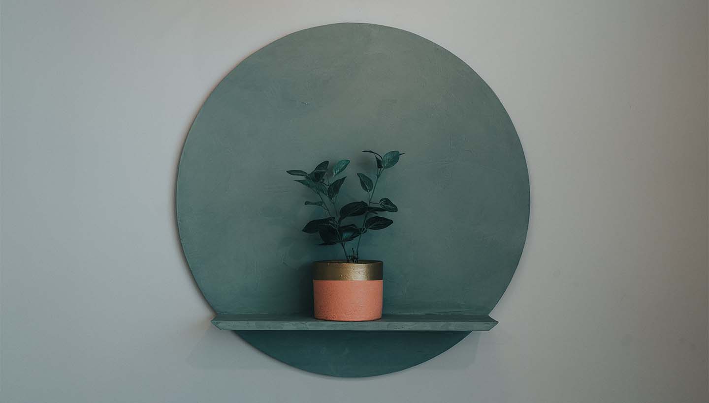
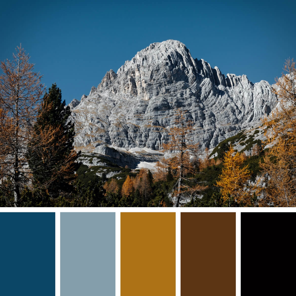
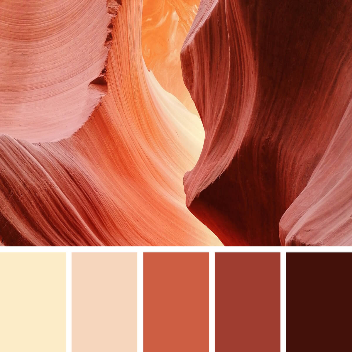
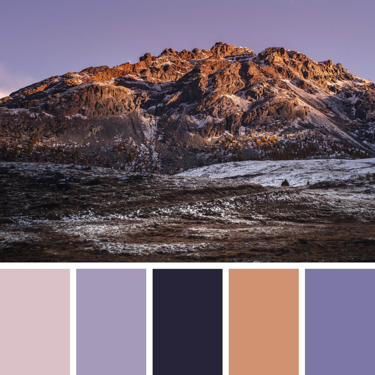
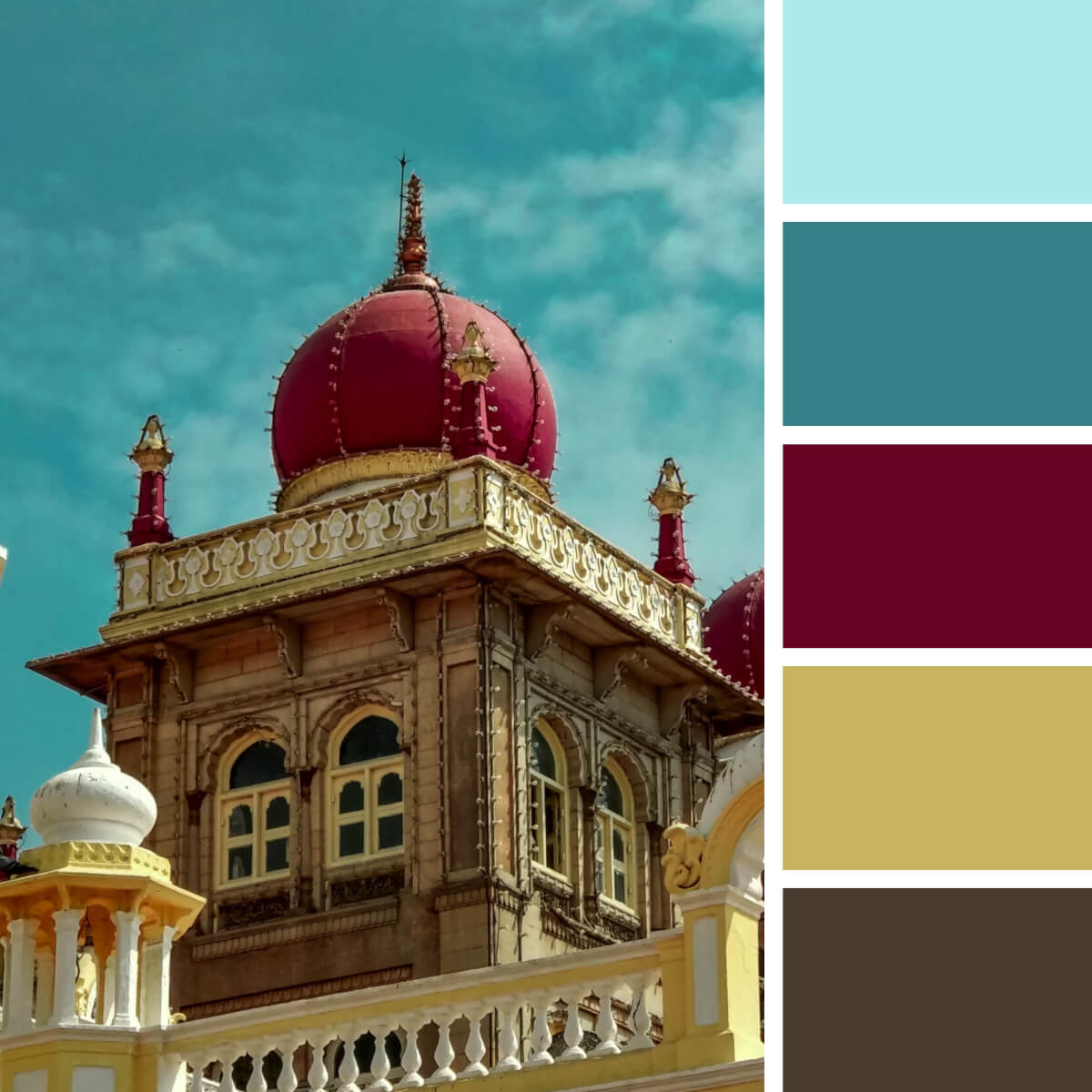
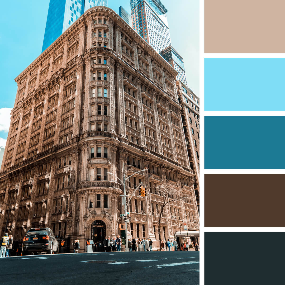
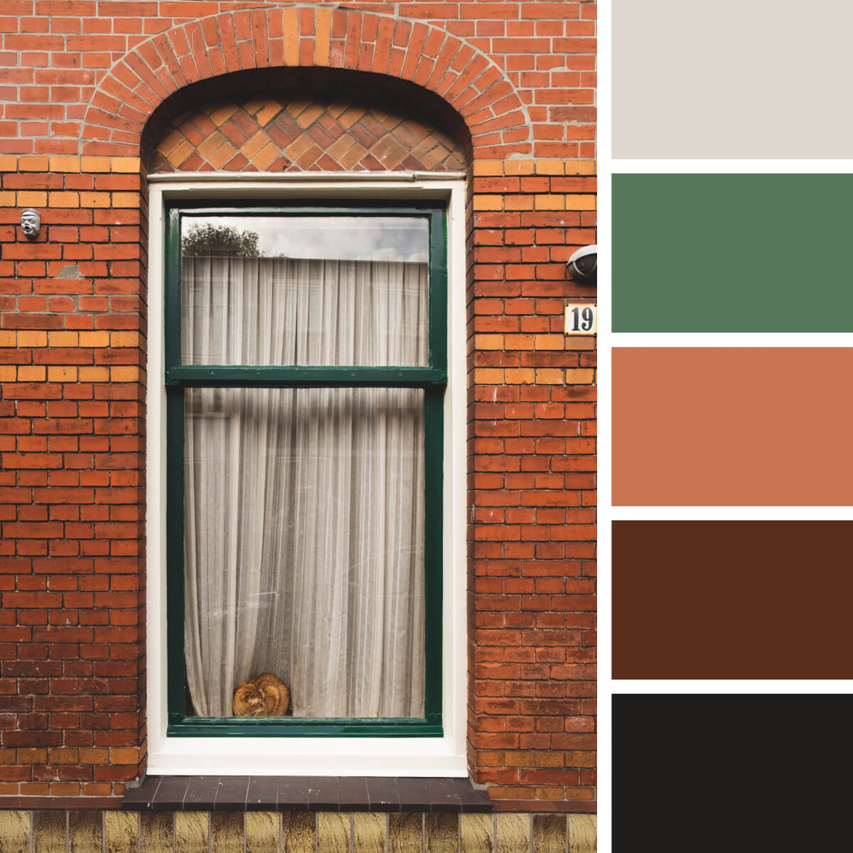
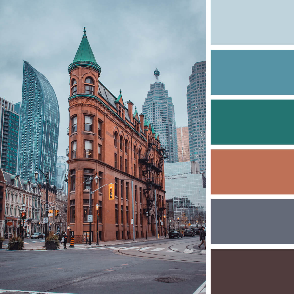
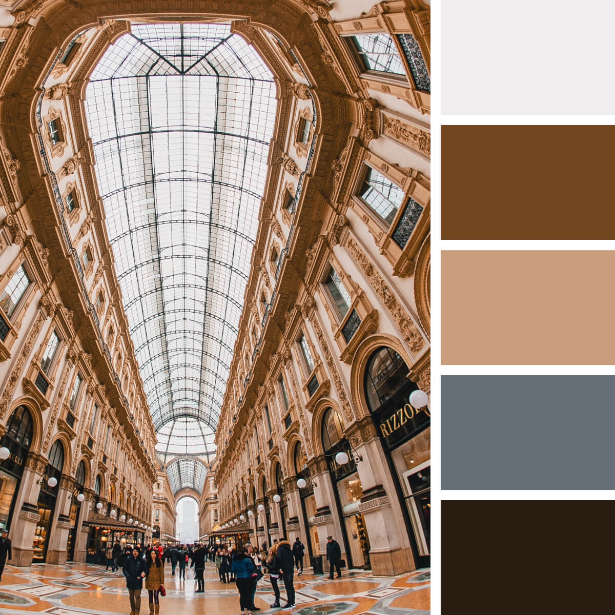
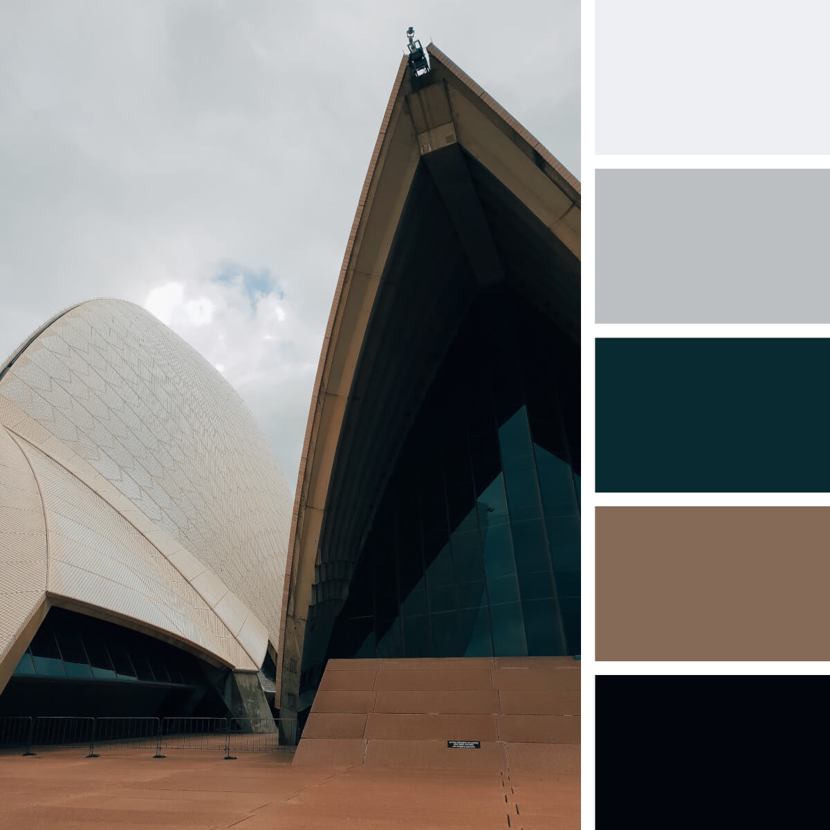
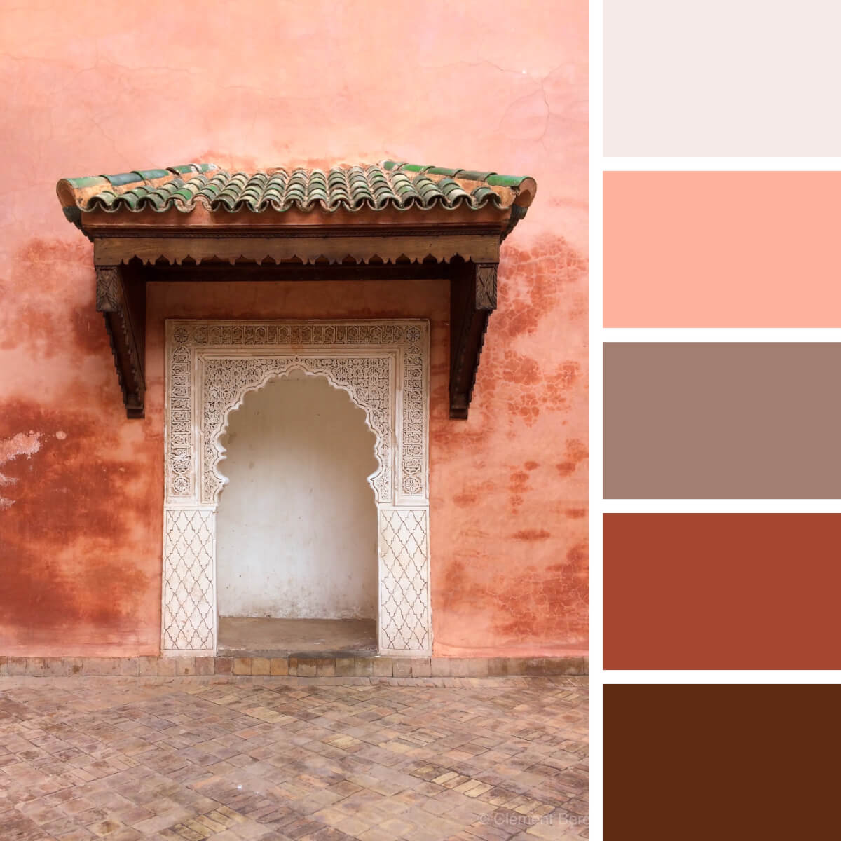
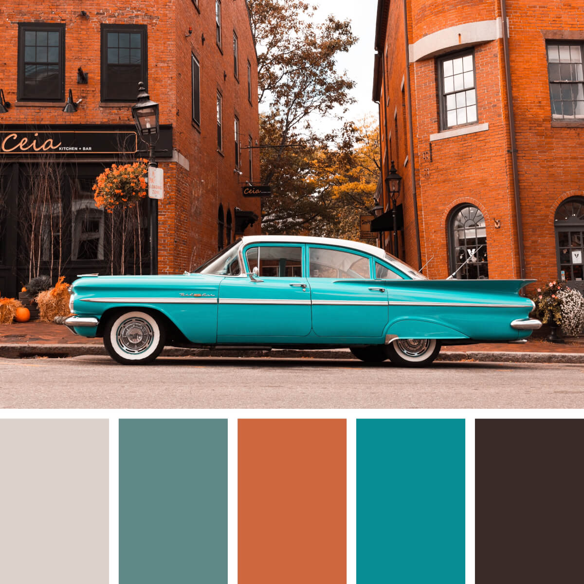
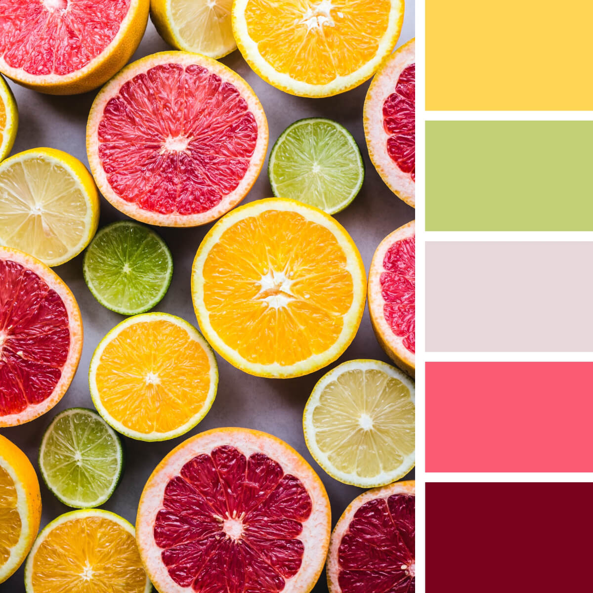
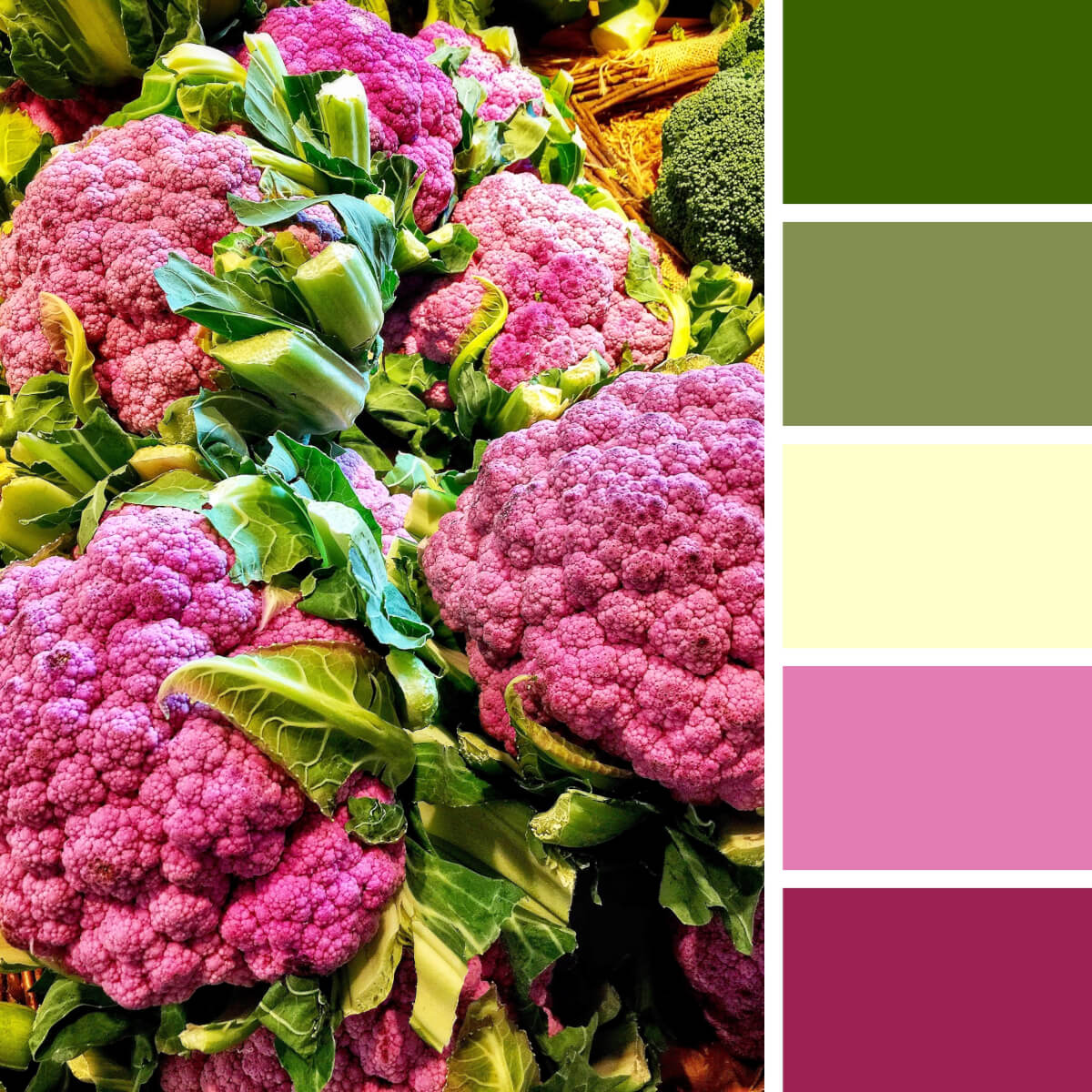
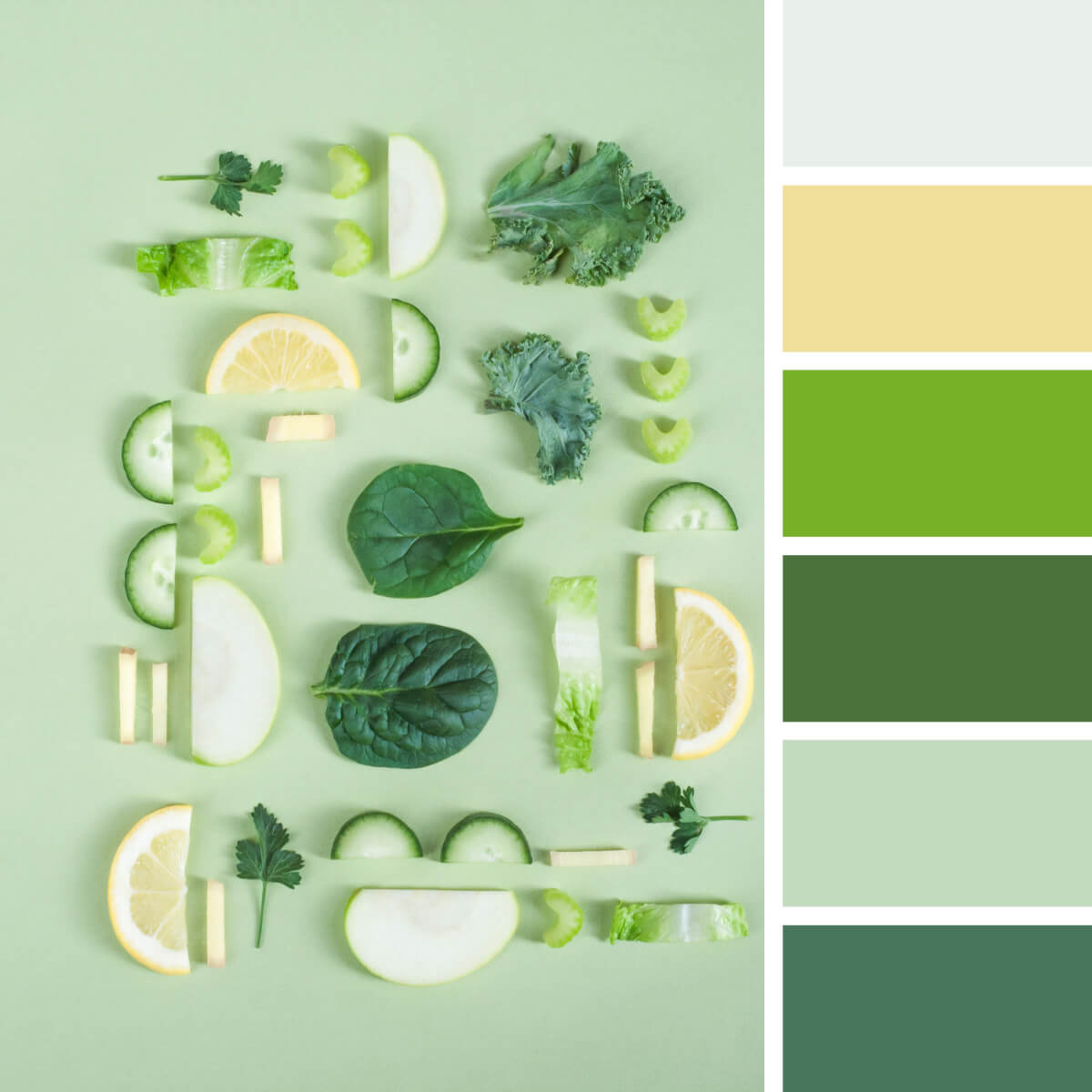
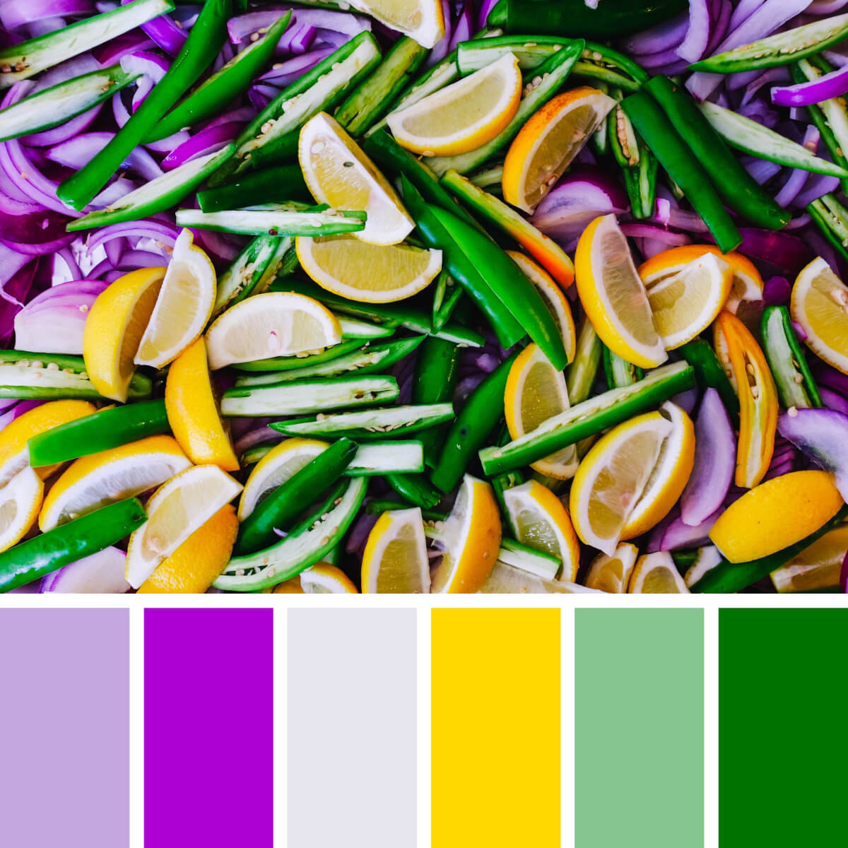
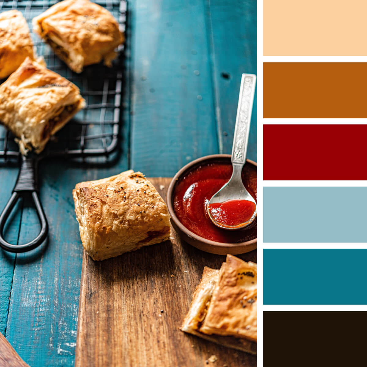
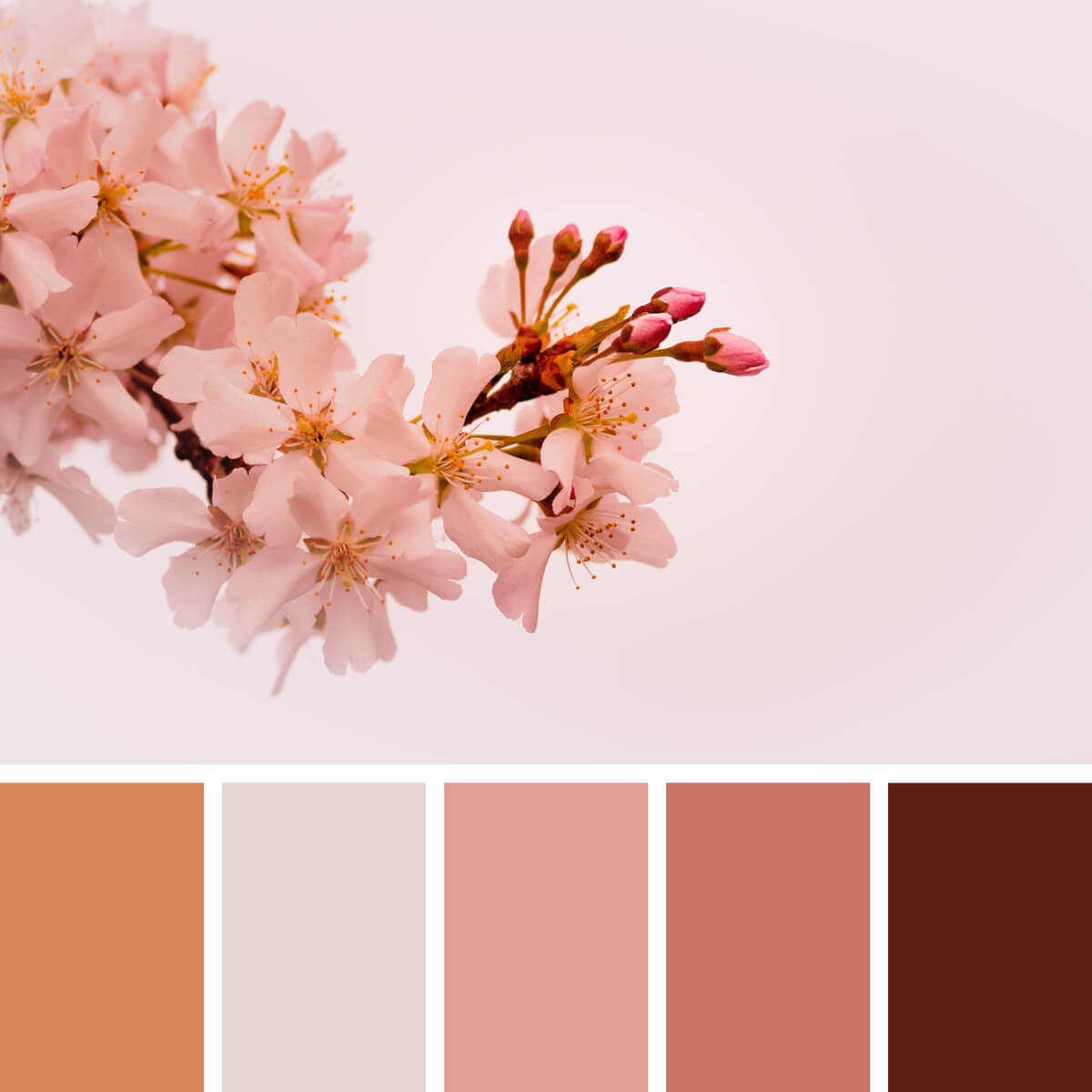
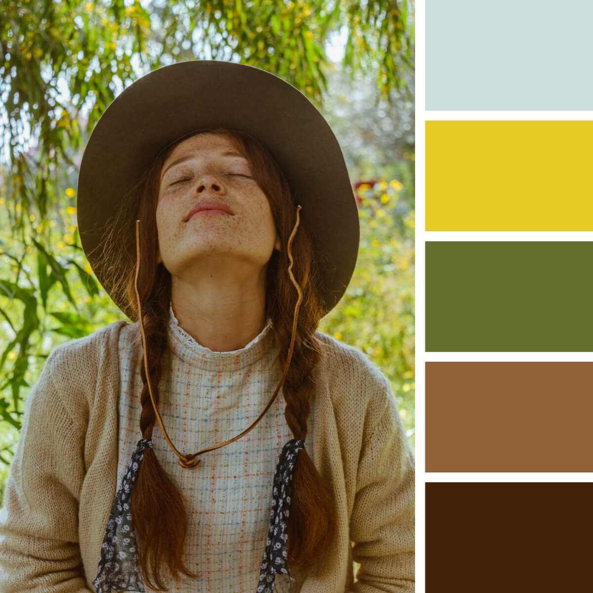
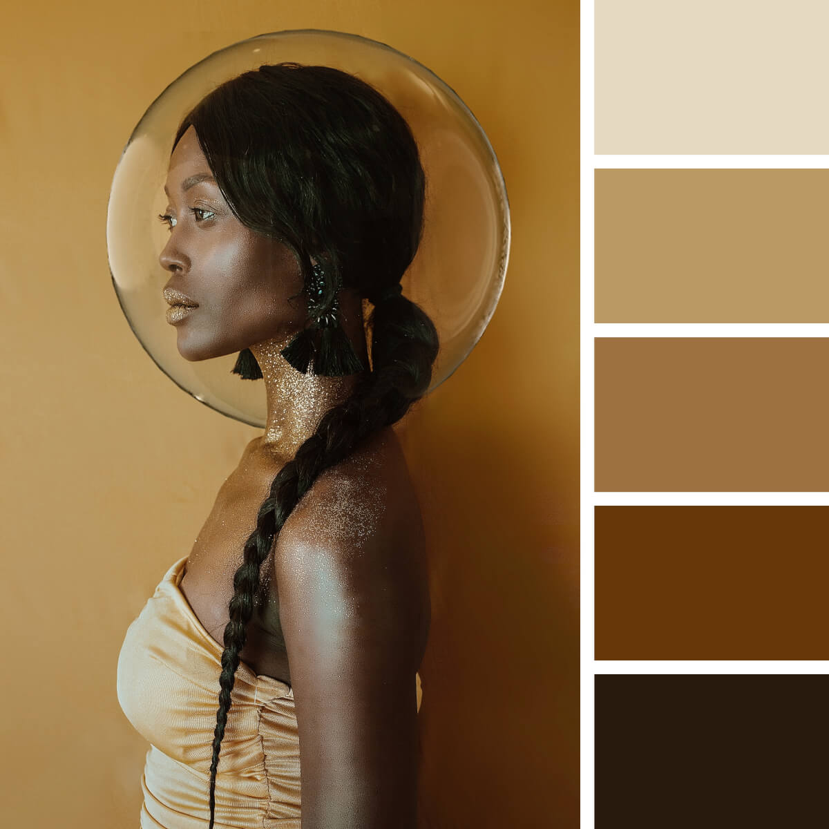
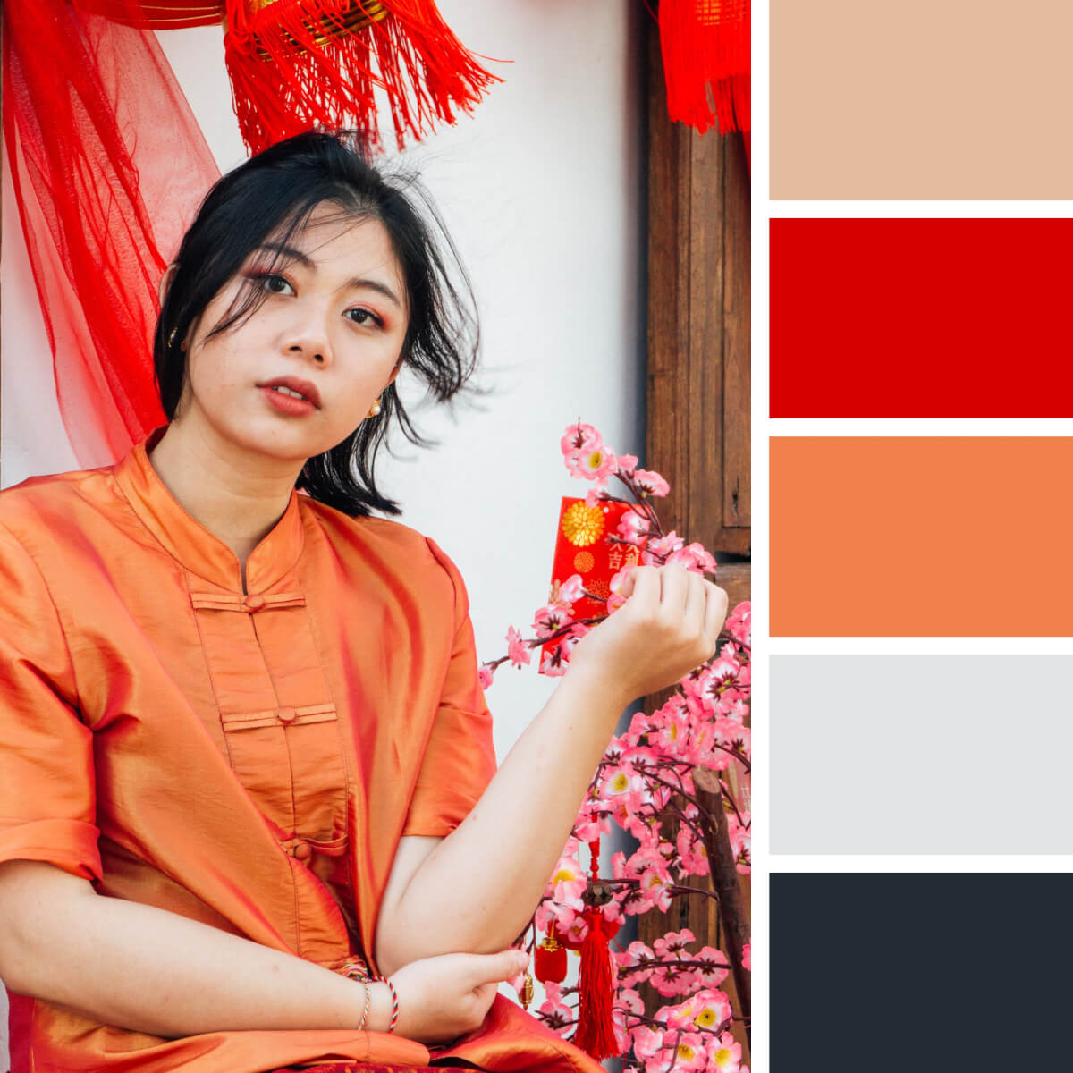
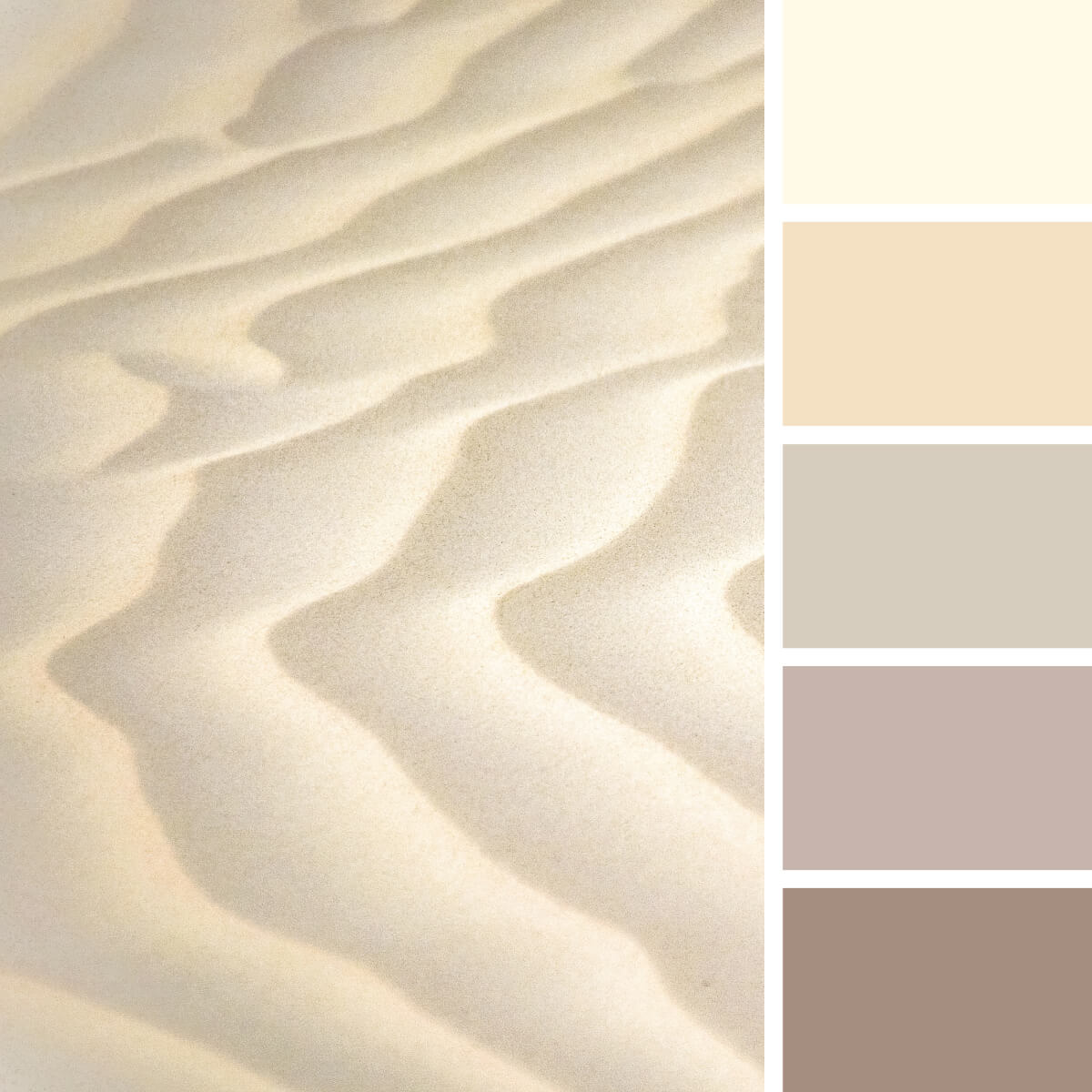
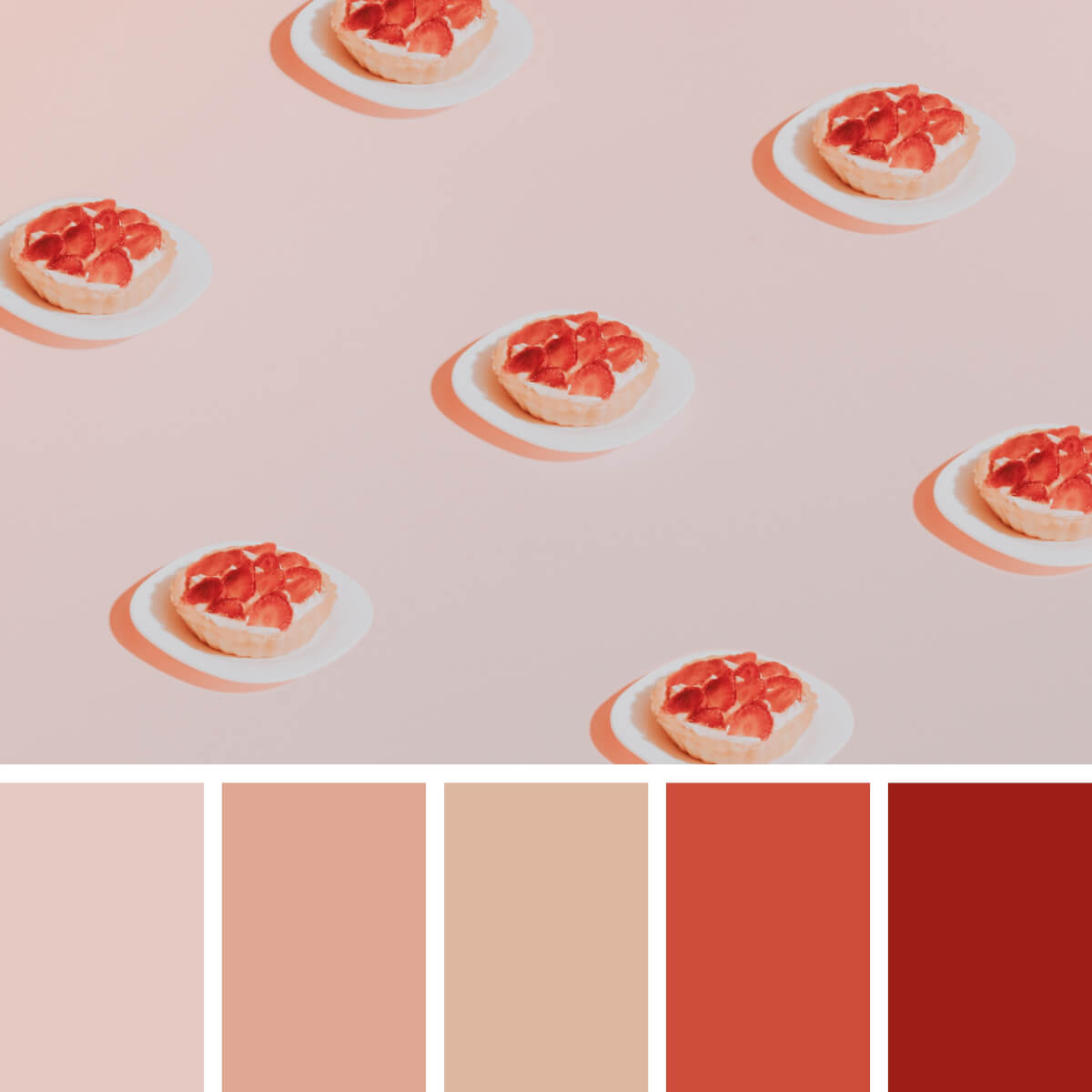
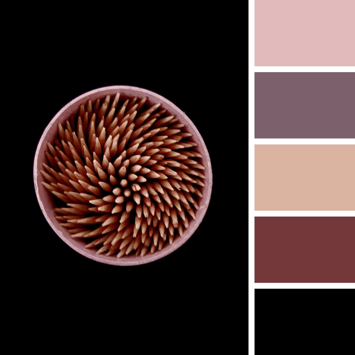
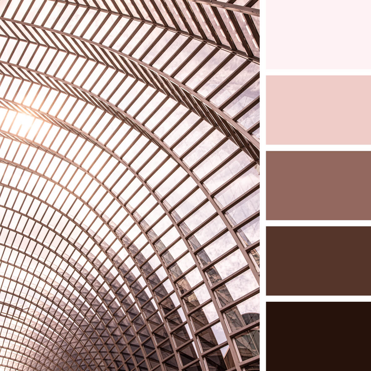
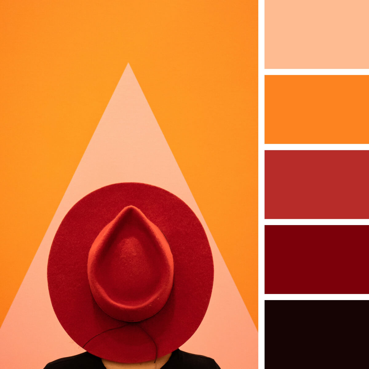
Despite globalization taking over the world, there are still peculiar artifacts of cultural heritage keeping its presence up to date. The color combination of deep brown, red, and orange used together is extremely ethnic, to say the least. This color scheme possesses different symbolic meanings, inspired by the plain life of simple folks: soil, sun, spices, and everything surrounding them.

Basic Mint & Gray

The mild grey-green fabric texture is gently flowing down, meeting the pure white to express a tender purity. Look how perfectly the darker background gives a chance for the first plan to stay in the limelight, gently outlining it. The shadowy tones presented not as the “invaders” but more as noble protectors of this fragility, great idea for clothing brands and packaging design.
Warm Red & Soft Teal

Warm Red & Soft Teal

People with freckles and ginger hair are kissed by the sun! Taming this flame would be an endless battle against windmills, while staying in accord will give more results. What can go better with such an unrestrained power than a nerve-soothing blue hue? It seems like these ones are truly meant for each other — so why don’t you still this warm and rejoicing harmony to your design work?

Leafy Green & Milky White

Sometimes a desire to ditch all the worries, work and mundane routines get the upper hand and it’s nice to have a bicycle, that will take you away from all the trouble. Look at the moss-resembling hat going so well with the forest green shades, milky white and golden hair. It’s hard to tell what captures the attention more: the spirit of adventures, a tastefully picked outfit or a vibrant color combination.
Cyan & Deep Blues

Cyan & Deep Blues

All shades of blue and teal are parading in the scene, cooperating with blond hair, sunbeams, and light grey sky. Take a closer look and you’re already there, splashing in the water, enjoying yourself. The striving for a brilliant color palette ends when you notice the pre-made combinations nature eloquently offers.
Rustic Greens & Brown

Rustic Greens & Brown

Odds are good that this selection, dissecting each shade in accordance with every other one, is eager to debut as also a fashion moodboard. What really created sparks is the ginger color with its orange and yellow neighbors, followed by the gold lightbeams in the rusty greens. Reserved beige clothing colors set the cozy rustic atmosphere.
Electric Blue & Orange

Electric Blue & Orange

Trippy merge of acidic colors and hypnotizing swirls play tricks with your perception in the blacked-out zone. You’re observing the miracle of making these two colors and their shades shine, piercing the twilight. They say, polarities gravitate to each other, and the same rule is applicable to imbedding neon-like coloring to rather dark backgrounds.
Neon Teal & Violet

Neon Teal & Violet

It’s impossible to pass by the neon-lit corner on the way back home from a roaring party: the smooth lighting makes everything look more beautiful. Taking pictures in a setting like this always turns out to be a great idea! Consider yourself lucky if the encountered sign flashes with light blue and pink colors from one side and teal-violet from another.

Noble Ebony & Gold

Behold the unfettered power of ebony, wrapped in sparkling gold. This color combination could rightfully earn acclaim in the race for aesthetics! In search for sophisticated imagery for your fashion photoshoot, keep tabs on a composition like this one: cosmetics and jewelry-promoting photography will turn out marvelously.

Cherry Red & Pale Blue

Black and cherry red shades are puissant by themselves, it’s a risky business to allocate these forceful elements into one design essence to make it bewildering. Armed with this color scheme as a cheat sheet guide to composition, pay attention to the way one can de-escalate tension via letting brown and cool blue hues in the game.
Playful Pink & Lilac

Playful Pink & Lilac

Oh that playful vintage: muted grainy colors, mild textures, and scrumptious violet tones in a sunny light. Do you feel the time slowing down, inviting to halt and seize the moment in these two colors? Sense the tangible purring muted colors and remember the feeling they transfer, ‘cause one of the upcoming projects might need that.

Sea Turquoise & Peach

Graceful gentle lines of a beautiful girl’s face, interacting with terse straight surfaces in the background setting benefit from a refreshing citrus orange color, accompanied by blue and teal tones. The picture gets only better with a slight accent put by white. The summery color combination can serve as a landmark for your design project — from brand concepts to event posters.
Chinese Red & Orange

Chinese Red & Orange

Chinese culture is lush with orange, red and pink in their omnifarious arrangements and shades. Don’t be shy to borrow the already paired combinations from cultural motifs to experience how successful this palette solution can be in your work. Even with the prepared color scheme, the initiative is all yours — experiment with saturation and contrast!

Patterns and Abstract Color Combinations

Beauty is in the eye of the beholder, so we invite you to explore the endless beauty of color, texture, contrast, and shadow of abstract compositions. You’ve already explored the urban and natural landscapes, so now it’s time to create that very color combination from the everyday objects. That’s how you can learn to see the colors of the world around you!
Monochrome Violet & Lilac

Monochrome Violet & Lilac

Gemstones and minerals can show a fascinating versatility of color schemes. These rarely feature primary colors and can present a richness of tertiary colors inside tetradic and complementary color combos. And the one we have here is a monochrome color combination that combines both subtle and saturated hues of violet. It looks vibrant and extremely engaging — not to mention how well it can fit interior, stationery and logo design projects.
Pastel Mint & Gray

Pastel Mint & Gray

If you seek a color combination that could help you showcase your brand design with dignity and sophistication, this one might work. That’s not the contrast magic that makes it so unique but a very engaging pastel color scheme. With gray, grey-beige, and trendy greens with a touch of mint freshness, this palette turns into a real design treasure.
Basic Green, Yellow & Gray

Basic Green, Yellow & Gray

It’s always exciting how only three primary colors create an endless number of blue, red, and yellow shades — not to mention the overall color versatility! And it’s also exciting to compare this color combination with the previous one. Now, there is only one neutral element, while other colors are filled with energy — which you’ll probably want to bring to your design work.

Magnetic Orange & Teal

There is an entire universe built by this abstraction — water droplets and light create a whole new world with unique color schemes and vibe. This combination contains two colors, teal and red yellow, while other tones play mostly as a background or a means to highlight the contrast. It may be hard to work with this color combination, however, if you are ready for some challenges and seek a modern look for your design work, you should give it a go.
Sandy & Milky Beige

Sandy & Milky Beige

While exploring the landscapes of Western Australia, a sandy beige color combination is a popular discovery. However, the set of tones and hues can always be different. It can be warm as expected or cool, thanks to the gray undertones. Alternatively, it can bring sunny shades of gold. In this case, the color scheme is very reserved and neutral, making it so easy to work with whatever your design project is.
Liquid Pink & Fuchsia

Liquid Pink & Fuchsia

Do you know what Ebru is? It’s an art of painting of water — and the perfect way to create flawless compositions. Hence with a few drops of black and pink, it’s possible to create not just a popular color combination but an eye-catching abstraction. True, there are only two colors in this bright monochrome palette, perfect for modern design projects.
Concrete Gray & Orange

Concrete Gray & Orange

Spin the color wheel and let it decide which color combination you’ll have today. If you’ve got gray and orange, you’re a lucky thing, as it’s one of the most popular solutions for logo design and branding. With only two colors, you can speak different massages and create a design project fitting various businesses and purposes.
Lime Green & Gray

Lime Green & Gray

If you are a fan of gray-based color combos, you don’t have to stay with a classic gray-orange or gray-yellow combination. Lime green is a cool option too, and it’s a great way to add exceptional freshness and energy to any design project. So, you can design sportswear or anything else for a sports brand, create eco merchandise, and these two colors won’t let you down.

Coral Red & Sweet Peach

Coral Red & Sweet Peach

Coral red, peach and lots of neutral colors along — this color combination looks both tender and so delicious. Or is it just because of the strawberry cakes? Anyway, this palette featuring three colors and their sub-tones is a real treasure for anyone searching for a versatile color solution that flexibly adapts to various design projects and can be brought to packaging, logo design and print projects.
Moroccan Blue & Lime

Moroccan Blue & Lime

We still can’t stop the flow of appreciation to the Moroccan landscapes and the color schemes we can get from them. The traditional color scheme is extremely rich and varied: it combines various shades of teal, rare greens and blues, and of course, sunny red-yellow colors. Apparently, it’s hard to surprise anyone here — however, have you ever considered some lime yellow to highlight the cool blue tile? 

Grayish & Cool Greens

Grayish & Cool Greens

Is it a fanciful sea surface or a wall texture? You can set your imagination free and source inspiration from these colors and textures! It’s an eye-catching monochrome color combination where every shade of green is a great pick for modern design and interior projects. Since there is a huge trend for muted colors, now you have a very bold palette for such cases.

Contrastive Pink & Violet

Contrastive Pink & Violet

To obtain high contrast with your color combination, you don’t have to focus on popular solutions featuring two colors — like gray and red or any complementary pairings. There is an endless number of options, and the provided color scheme is just one of them. It combines pink and violet hues with deep dark brown, and whatever pairing you pick for your design, it will look eye-catching and bold.

Urban Pink & Metal

The sun colors metal as it likes, and it’s always beautiful. Here the sunrise has transformed the construction of glass and steel into a beautiful rose poudré masterpiece. This color combination of light pink and dark brown tones is extremely popular among branding designers and is a perfect pick for modern packaging design. It’s both bold and neutral, and that’s what customers like — so don’t overlook it!
Camouflage Gray & Green

Camouflage Gray & Green

We definitely couldn’t pass by this popular color scheme — camouflage. In fact, there are many combinations for it, and they can feature five, four, or just three different colors. So decide yourself which of the tones from this palette you are going to use in your design work. Since there is no great contrast between them, you’ll find it easy to combine the preferred shades and make something vibrant.

Techno Teal & Rosewood

Could you imagine a better color combination featuring teal? Many of them are pretty overused as teal hardly combines with other shades. Hopefully, here you can feast your eyes on the neutral, complementary colors that bring its freshness to the top and set up a favorable scheme for your graphic design experiments.

Airy & Tender Blues

All the most beautiful blues are here, in a single color scheme! The color range goes from light tones to the deep and dark ones, and there is pure fascination and charm in every piece of blue! If you always thought of primary colors as something boring and basic, just think of the endless number of shades you can create from them — even without ending up with secondary colors.
Juicy Red & Orange

Juicy Red & Orange

While red is often associated with high-contrast pairings, this color combination will prove you wrong. Peach, orange, coral, dark red, and deep brown create a vibrant and “expensive” scheme that strikes with brightness but never obsessive contrast. It’s an excellent option for print design, merchandise and whenever you need something perfectly matching the focal primary color.

Basic Purple & Peach

Four colors that perfectly work together? It’s real! This color scheme combines dark peach, wine red, plus tones of violet and blue — and if it ever seemed impossible to put them together, now you’ve got a cheat sheet! Whatever mood you seek to convey, you can do it now. Your design work may look vibrant, bold or reserved just with a single palette.
Mesmerising Pink & Blues

Mesmerising Pink & Blues

That’s definitely our favorite color combination, and we’re curious if anyone could resist its tenderness. A pinch of cool blues, a couple of light pink hues, and some deep dark olive to add some contrast — and here, we’ve got a palette that can work literally for anyone and for any design project you seek to onboard. Neutral colors have already been easy to work with — and we assume these are not an exception.
Urban Brown & Blue

Urban Brown & Blue

Blue and brown are a very popular color combination widely used by businesses. Branding design, printed products and logos — these colors always make the right effect. Apparently, this pairing of cool and warm tones is one of the best a color wheel could suggest for a clear image. And if you need to increase vibrancy, just play with contrast and saturation!

Frequently Asked Questions

What color combinations go well together?
The key to the success of creating well-balanced color combinations is pretty easy: you just need to follow some simple rules and schemes. There are 4 main types of such patterns, based on a color wheel: choosing the colors that sit opposite each other, colors placed on each vertex of an imaginary equilateral triangle, 2-5 colors that are placed next to one another or 4 colors that are equidistant apart.
What is the best 3-color combination?
If you need to create a color combination consisting of 3 colors, I recommend you to check the triadic and analogous rules of working with the color wheel. According to them, you need to either take colors placed on each vertex of an equilateral triangle or the ones that sit next to one another. Also, you need to consider what are you creating a color combination for as it will evoke certain emotions.
What are the 4 best colors that go together?
When you have already decided how you want your product to affect the clients, you need to check the rules for creating color combinations. In case you need 4 colors to be included, you may use analogous (made from colors from each vertex of an imaginary equilateral triangle) or tetradic (made of 4 colors that are equidistant apart) schemes of working with the color wheel.
Tags: ColorPalette
Previous Post

11 Most Renowned Ukrainian Digital Companies and Design Studios 

Next Post

Best Courses for Modern Drawing: Manga, Comics, 3D Art and More

Ksenia Pedchenko

Ksenia Pedchenko

Related Posts

Best Drawing Programs & Apps in 2024 For Your Creativity

by The Designest Staff
February 7, 2024
9

In 2024, art software scene is as diverse as ever. Read our guide to the top free and paid drawing...

Top Graphic Design Projects That Can Enhance Your College Portfolio

by The Designest Staff
January 26, 2024
0

What projects should you include to ensure your portfolio stands out? Let's dive in.

50+ Best Mug Mockup Templates ⬆ Download PSD

by Alina Yakovleva
January 24, 2024
0

No matter what season is outside, a mug of warming beverages will always give you a calming feeling. Your designs...

40+ Best Cap & Hat Mockup Templates

by Ksenia Pedchenko
January 22, 2024
0

Let's play big! Use baseball hat mockups for your presentations and create scenes to please MLB fans themselves.

⬆ 70+ Best Photoshop Text Effect PSD Templates

by The Designest Staff
January 20, 2024
6

Gain the power to reinforce your typography and make it more eloquent with a selection of pro-grade free text styles...

50+ Best Hippie Fonts: Groovy and Free-Spirited

by The Designest Staff
January 17, 2024
0

Make design, not war! We invite you to submerge in the quaint aesthetic of the 60s and discover hippie fonts...

Next Post

Best Courses for Modern Drawing: Manga, Comics, 3D Art and More

Please login to join discussion

Popular Posts

  • Logo Design Trends 2024: Outburst of  Typography & Symbolism

  • Free CD Mockup Set For The Iconic Retro Design

  • Freebie: a logo mockup, charged with elegance

  • Freebie: Aluminium Can Mockup

  • 20 Digital Artists You Should Know: Famous, Talented, Inspiring

Categories

  • Design (80)
  • Freebies (88)
  • Inspiration (40)
  • Other (22)
  • Tech (26)
  • Toolbox (161)
  • Tutorials (57)
Youtube Facebook Instagram Dribbble Pinterest Twitter RSS

Subscribe

The Designest

Weekly Email Updates

We got tons of fascinating articles, videos and freebies for you every week!

SUBSCRIBE

Design Blog

  • Design
  • Freebies
  • Inspiration
  • Other
  • Tech
  • Toolbox
  • Tutorials

About Us

Welcome to The Designest — a professional design blog aimed to deliver fresh news & trends of the industry as well as the most essential courses & tutorials you must have been searching for.

Company

  • Advertise with Us
  • Contact Us
  • Cookie Policy
  • Privacy Policy
  • Terms and Conditions
  • Affiliate Disclosure
Advertise Options

© 2023 The Designest — Professional design blog aimed to deliver fresh news & trends of the industry

No Result
View All Result
  • Home
  • Design
  • Freebies
  • Toolbox
  • Tech
  • Tutorials
  • Inspiration

© 2023 The Designest — Professional design blog aimed to deliver fresh news & trends of the industry

Subscribe to Regular Updates
We got tons of fascinating articles, videos and
freebies for you every week.
This website uses cookies. By continuing to use this website you are giving consent to cookies being used. Visit our Privacy and Cookie Policy.